Category Archives: conference

ICC, Cape Town, South Africa – 3D Models and UN Acronym Soup

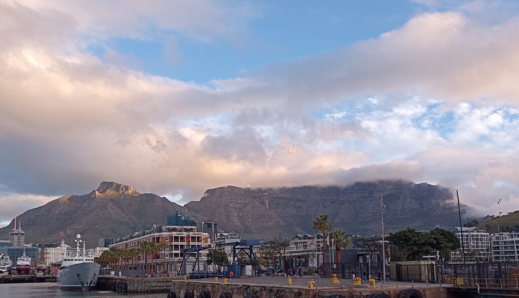
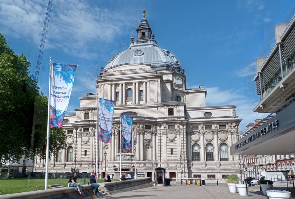
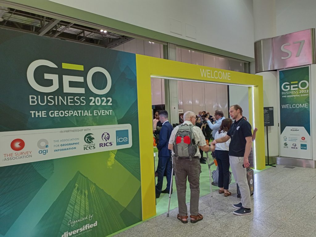
A couple of weeks ago I spent a fantastic week in Cape Town, South Africa, attending the 2023 International Cartographic Conference. The ICC (not to be confused with the International Cricket Council!) is held every two years by the International Cartographic Association (ICA). It’s a global conference, and this is the second time it has taken place in South Africa, previously being hosted in Durban in 2003.

The conference covers everything under the umbrella of Cartography and GIScience, with papers ranging from user assessments to theoretical discussions, covering topics as wide as cartographic methods, generalisation, COVID, navigation, education, spatial data infrastructures and many many other topics. There is plenty of overlap with the Cartography and Geographic Information Science journal (CaGIS Journal), and a number of us from the academic board were attending to present our work, connect with authors and discover new articles. I work as Cartographic Editor for CaGIS, and it was great to see some published work presented, and discover new authors who might write for the journal.

3D Models

I was particularly impressed by work developing methods to provide 3D models with interactive elements to people who are blind or visually impaired. Jakub Wabiński developed a 3D printed tactile model which has been published in CaGIS and Jan Brus and Radek Barvir presented a process to 3D print models with conductive elements so users can press on certain locations which then prompts a mobile phone to play a verbal recording describing that feature.

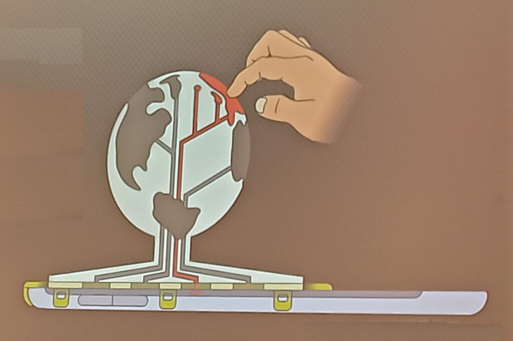
The 3D model uses conductive strips to link the touch on designated areas of the 3D model to the tablet underneath, which then pays the relevant audio narration. This allows many different relatively cheap 3D printed models to be used with one tablet.

UN Acronym Soup

The ICA is quite a large organisation with a long history, and has good links with a number of United Nations (UN) groups and initiatives, including UN GGIM – UN Committee of Experts on Global Geospatial Information Management and UN IGIF – Integrated Geospatial Information Framework. The IGIF is a multidimensional framework that provides countries with a basis for developing, integrating, strengthening, and benefiting from geospatial information management. There is a risk of drowning in acronym soup when it comes to working with the UN, and I had some great discussions when asking a number of people how UN groups and initiatives like GGIM or IGIF have made an impact in the real world. I had a range of different answers, from ‘I have no idea!’ to ‘having these programmes is better than nothing, so they probably have some impact’ to some much more detailed responses (see below).

To me, it was certainly clear that the UN could do a better job of explaining what it is doing in the area of geospatial in a way that can be easily understood. However, there are some great outputs from a variety of UN departments. Firstly, there are the Sustainable Development Goals, which is probably one of their most well known activities:

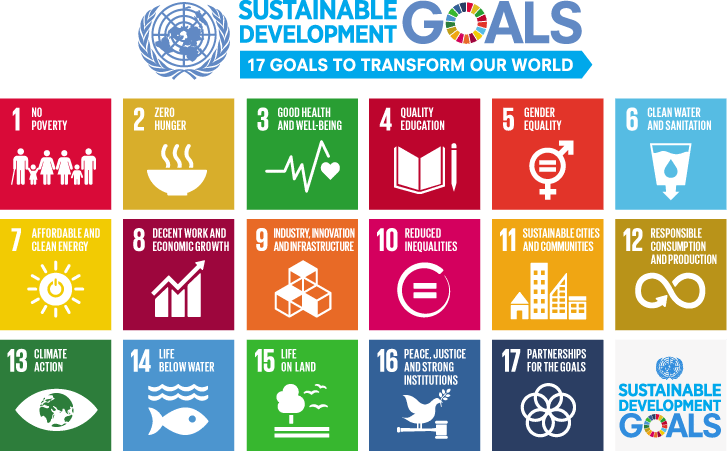
The 17 Sustainable Development Goals are often illustrated using this image, or a variation of it. Originally from https://www.un.org/sustainabledevelopment/blog/2015/12/sustainable-development-goals-kick-off-with-start-of-new-year/.

These are something many people have heard of, and provide a series of targets to help all countries develop sustainably. Many others can describe them better than I can (see the UN, Concern, one of the keynote presentations at the conference from Greg Scott and even Google) but one striking image is the discussion of how to measure the progress in achieving these goals, and the fact that for a number of the goals some countries are actually going backwards. Managing the data for these is a key issue, and a number of goals are quite difficult to measure, with some countries not having the data to be able to measure the progress (or lack thereof). It is possible that in comes cases this may be deliberate (for example, China reducing the number of statistics they publish because they were showing a bad message) but I think in most of the cases it is because a) the goals are tricky to measure and b) they often require specific resources which may not be available.

Returning to UN GGIM & IGIF, accessibility of data is one of the key focus areas of the UN GGIM. One of their core aims is helping all countries develop their spatial data infrastructures, that is the national organisations that manage, maintain and make accessible their spatial data. The UN IGIF is a framework that will help countries in this process – highlighting best practice and examples of how to do this. Of course every country is at a different stage in the process, but from discussions at the ICC, every country is keen to progress their work.

Gobe Hobona from the OGC (Open Geospatial Consortium) gave me a very good explanation of IGIF, which formed part of the description above. He also compared it to INSPIRE, which is the European Union (EU) initiative on spatial data infrastructure, and is probably 10-15 years ahead of IGIF. INSPIRE has provided a framework for structuring spatial data and metadata across the EU, and therefore making data (including spatial data) much more accessible by providing information about it in a structured way. Similar initiatives exist in the UK, for example on the data.gov.uk site – you can search for many different UK government related data sets there, and one of the key underpinning structures is Gemini which makes this possible. More specifically, the Gemini standard is a profile of the ISO 19115 standard that facilitates conformance to INSPIRE metadata implementing rules. A common thread across many of the geospatial data initiatives and frameworks is that they make use of OGC Standards.

Mapping for a Sustainable World

Another great output from the UN is Mapping for a Sustainable World, which is a fantastic publication from a collaboration from the UN and the ICA (ICC). It’s a free book, available as a PDF, covering two main aims. Firstly, it discusses how maps can be used to help monitor progress across all (13) sustainable development goals, for example Goal 5: Gender Equality.

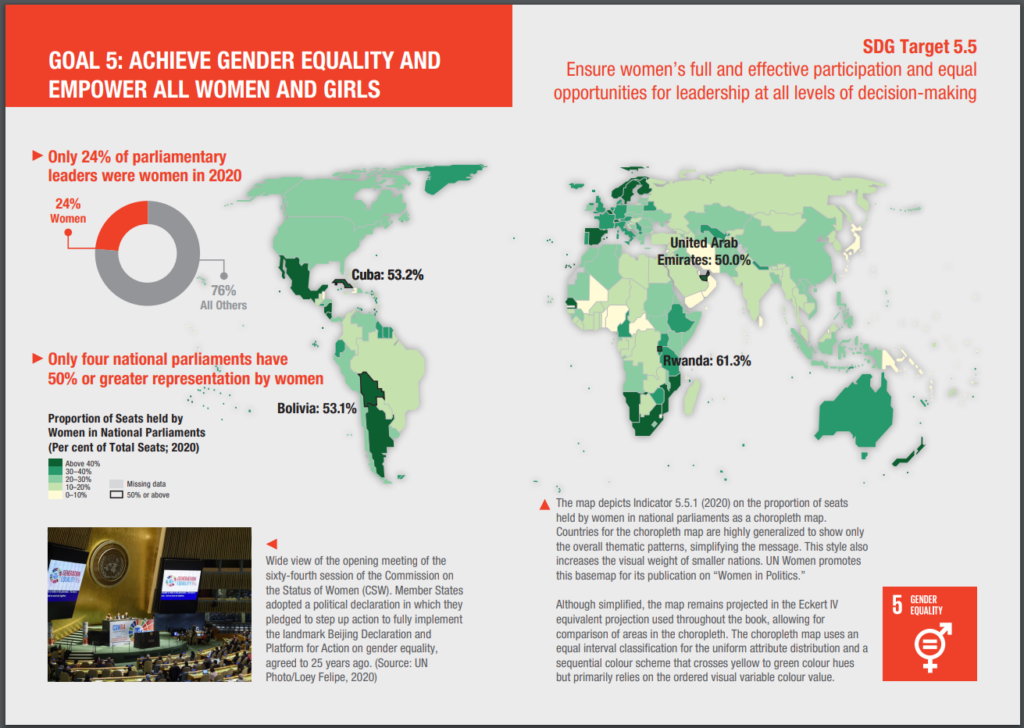
As example of applying spatial data to the Sustaible Development Goals. Page 54 & 55 from Mapping for a Sustainable World.

As well as discussing the availability of spatial data, it also covers practically every key aspect of working with spatial data and GIS (projections, MAUP, classification, scale, generalisation, colour, typography and so on), it also gives examples of 14 different types of map (thematic, nominal, choropleth, etc.) and discusses different environments for map use (both in terms of audience and medium).

I was fortunate enough to meet one of the co authors, Britta Ricker, at the CaGIS reception, and heard about some of the challenges in pulling this book together, including methods that are not well known, but potentially very useful (e.g. dasymetric mapping), and UN’s approach to boundaries (e.g how to show disputed areas such as Tiwain, Crimea, Israel/Palestine, etc.). This is a well known geographical issue, as discussed shown in MapTiler, Google, Apple Maps, and even as discussed by James Cheshire on Christmas decorations! The UN also has a standard detailing these issues, as well as maps people can use themselves, including officail UN boundaries in their web maps.

They had some print copies available in English and French at the conference, and both can be downloaded as PDFs for free from https://digitallibrary.un.org/record/3898826?ln=en0.

As well as seeing a wide range of presentations across the whole range of Cartography and GIScience (let me know if you’re interested in publishing in CaGIS!), it was great to meet and network with a whole range of people passionate about cartography and GIScience from around the world. This conference also included a record proportion of attendees from both the African continent (450 and South Africa itself (385), which was fantastic to see (stats from map of attendee home country on https://icc2023.org/). A number of those I spoke to said they would be unable to attend if the conference was outside Africa due to funding restrictions, so it was great for them to have this opportunity.

ESRI UK & GeoBusiness: GeoAI & Digital Twins

View from the Queen Elizabeth II Conference Centre, location of ESRI UK AC

Along with many other people from the geospatial community, I was up in London earlier this week for ESRI UK Annual Conference, GeoBusiness and Spatial Data Science Conference. It was a great couple of days, and while I didn’t manage to attend everything (limited time, money and energy!) it was great to see and hear what I did.

ESRI UK’s Annual Conference had a couple fewer streams than usual, but it was still as busy. I also managed to get into one of the over subscribed training sessions, to see what had changed in ArcGIS Online recently. Digital twins were mentioned quite a bit, developing from my blog post about last year’s conference, and the vocabulary is evolving and the focus has now shifted to how they are actually useful.

Jurassic Fibre gave a great presentation about how their as-built survey validation process made use of in field tools to collect and verify data. They were comparing what was planned to be built against what was actually built, and had some great processes for managing this. It really shows not just how important data is, but also how important how linking different teams together is important to deliver a service.

Discussions and catching-up at ESRI UK annual conference

I also had some really useful discussions about sharing data between platforms – some people use ArcGIS, some use QGIS, some R, and so on. Everyone has good reasons for using the software they do, and it would be a hard struggle to get everyone (in a team, group or even organisation) to use the same software – and more often that not will be a waste of time. What can be done is to help everyone make use of the same data, and / or share data in exchangeable formats.

Accessibility also had a focus in the end keynote presentation, combined with ChatGPT. Large language models create great potential for interacting with maps and spatial data in a different way – a prototype demo showed how a user could verbally ask for information about a map, and the computer could give a verbal summary. No where near production yet, but it shows what could happen. There is a huge amount of potential here – with developing better interfaces for those suffering from visual impairment – or for better natural language interaction with maps. This linked a bit in with my PhD work, from 2008-2011, focusing on sonification, where I used sound to represent data in combination with vision. There are some videos and code demonstrating this (I’m sure the VBA code in ArcMap will no longer work, not the Google Maps API code, but the videos how how it worked!), as well as my PhD thesis itself.

Sonification – from a few years ago 😉

Will ChatGPT replace GIS Analysts? I don’t think so, so we will all still have jobs! It will certainly change what we can do, and some jobs will change. With any LLM, you need to know how to ask the right question as well as being able to understand the answer that comes back. Ultimately the skills will be in interpreting the results, and making a judgement call about whether it is useful or not. Google revolutionised the internet when it was launched – and LLMs will be no different. As ever, we always need to be critical of maps and spatial analysis output – and ChatGPT or Bard or any other LLM will not change that. If anything, it will make it more important!

“So don’t just use GIS, but use it critically.”

I also popped into the Spatial Data Science Conference party in Wednesday night, and it sounds like the conference was fantastic – next time perhaps!

GeoBusiness followed ESRI AC UK, with a huge range of geo related businesses hosting stands and presenting talks. The stands were very equipment focused, with many new drones and surveying tool available to have a look at and discuss. However I was more interested in the talks and networking opportunities. The skills shortage was again raised as an issue, with not enough people available with geospatial skills. However speaking with those at the coal faces, new graduate with geospatial skills are being tempted away with starting salaries of £5k – £10k more for similar roles outside geospatial (e.g. programming) and even more for data science roles. It’s a hard ask for someone to give up £5k – £10k a year to stay in geospatial!

Developing skills of people coming into geospatial is something that is of particular interest to me, with a range of initiatives around training and skills development. While many users are big ESRI clients, there is certainly an increase in people wanting to use ESRI along side open source solutions – particularly QGIS. I see lots of potential for North Road’s SLYR tool, what they term: the ESRI to QGIS Compatibility Suite.

There are so many novel applications of GI data and one in particular caught my eye – ClearSky, a product from Aspia Space, have created a AI algorithm which converts uses cloud-penetrating Synthetic Aperture Radar (SAR) data to create cloudless multispectral imaging, right across the visible and short-wave infrared spectrum. This allows a ‘cloud-free’ view of satellite imagery – an interesting and valuable resource.

A different, but potentially equally useful application of GIS data was presented by Christopher Jackson from Advanced Infrastructure talking about geospatial tools for energy. They have created an application to help local councils estimate where it may be viable to install electric car charging points. The GIS analysis itself is not that ground breaking, as they are looking at a combination of IMD data, street width and electricity supply provision data to estimate feasibility and cost of electric car charging point installation – but the fact they think this is worth building into a product that can be sold is. It shows how vital geospatial data is and reminds me of the fact that there are still many people out there who don’t know what geospatial is. Communicating this is one thing we could all do better at.

It was great to see so many people, and chat about upcoming projects and opportunities, including FOSS4G:UK 2023 – watch this space(s) for more details soon: OSGeo:UK!

ESRI UK & GEO Business: Digital Twins or just Digital Offspring?

Last week I attended the first ESRI UK Annual Conference (17th May) and the first GEO Business conference (18th & 19th May) for three years (although GEO Business had a conference last autumn, which I didn’t manage to attend). It was great to be back at the Queen Elizabeth II Centre for the ESRI UK Annual Conference – it is always a great opportunity to meet colleagues working in GIS in the UK across all industries. Clearly open source didn’t feature that much (!) but all of the ESRI tools were showcased and it was a great opportunity to see what is coming up over the next year.

ESRI UK Annual Conference at QEII Centre, Westminster, London

Sustainability was the key theme of the conference, “GIS – Creating a Sustainable Future”, with the Met Office delivering the keynote focusing on climate change. I actually missed their presentation (a long train journey!) but hearing from other participants it sounded a good presentation, although there was the question of how we turn talk about climate change at the conference into action that makes a real difference in the world.

ESRI were very keen to push the ArcGIS Suite as a set of capabilities and focusing on what you can do with their tools, rather than the tools themselves. Highlights include new graph data structures now available in ArcGIS Pro, the versatility of LiDAR data and ArcGIS Image for ArcGIS Online, ESRI’s response to Google Earth Engine allowing processing of large satellite data in the cloud. On that note, ArcGIS Online was first launched ten years ago – which was a slight shock to many attendees! It has gone from strength to strength – and I do like how the ArcGIS products have made GIS more accessible to new users.

ArcGIS Hub also featured prominaty as a way of collating information and making it avaialbe to non-GIS users. We also heard about deep learning models being features in the Living Atlas, real time vechicle tracking (although interestingly no mention of ethics), and greater links with AutoDesk billed as ArcGIS GeoBIM. ESRI are also very keen on pushing greater use of the cloud – either provided through ESRI’s owns services, or, longer term, hosting the various ArcGIS products on the cloud yourself. We saw a great semo of ArcGIS Geoanalytics running a Python Notebook on databricks.

Finally, we had various mentions of ‘digital twins’. I remember the last GEO Business conference I went to in 2019 there was a lot of talk about digital twins, but nobody had actually created and used one. Now, a number of people have. One example was a model of buildings in London including information on how much water might be needed by the fire brigade to extinguish a blaze in a specific building and whether the water supply network could supply the needed amount of water. A few people weren’t convinced these were digital twins – as the key definition of a digital twin is that it includes real time updates. However, ‘real-time’ depends a bit on what temporal scale you are working to – and the amount of water needed to extinguish a blaze in a specific building probably wouldn’t change that much – so I think this is very case dependent.

GEO Business 2022 at ExCeL, London

I also attended the GEO Business conference out at ExCeL on the following day. Again, this was a great networking opportunity, although with a slightly different subset of the geospatial community. I went to a couple of very interesting applications talks – including one from the Met Office by Anthony Veal, who was working on a pilot project to increase the rated capacity of overhead electricity lines depending on the weather. Currently, overhead lines are rated for their maximum capacity based on a worse case weather scenario, which is rarely reached. Heat is the main limiting factor on the lines, with wind being the primary mitigating factor. This project is working on moving from a static worst case scenario limit to dynamic limits based on the current wind conditions. It is still in relatively early stages, with one case study, but shows a potentially significant increase in capacity at certain times. This, arguably, could be considered a digital twin with its’ real time data but the Met Office didn’t use this term.

Doug Specht also gave an excellent talk on Teaching Geospatial Ethics, and how he approaches this with his audience of students who are not geographers, but are often asked to create maps. He summarised the issues as a very nice three principles:

  1. No visualisation is neutral
  2. Platforms have politics
  3. All perspectives are partial

This works very well for this students – journalists, writers and communication – and works as a great first step before looking at geospatial ethics frameworks like the Locus Charter.

Cloud processing also cropped up a lot at GEO Business, with many of the companies, large and small, offering new cloud based services for working with LiDAR point clouds, aerial photos and drones. There was also a nice expansion of engaging others with GIS and highlight how useful it can be across all professions – something I strongly believe in and see every day.

Overall it was a great couple of days, with lots to think about. Please do add your comments in below, and if you are interested in finding out how GIS could benefit your work, please check out my book GIS: Research Methods, the GIS courses I offer or reach out if you would like a chat.

Cross posted from https://www.geospatialtrainingsolutions.co.uk/esri-uk-geobusiness-digital-twins-or-just-digial-offspring/

To video, or not to video?

“That is the question.”

(Apologies to anyone who has studied English Literature, at any level!)

With nearly everyone participating in more and move video calls, “to share video or not to share video” is, indeed, the question. When participating in an online conference, should the audience members share their video?

We have all attended loads of video conferencing calls over the last 15 months, and I’ve been no expectation to this. I attended two conferences recently, and one thing that struck me was whether the audience members have their cameras on.

When I’m running a training course or presenting, I really love to be able to see people’s faces – so I can see who I am talking to. Of course, I realise this isn’t always possible or something the participants want to do (either because of bandwidth limitations, not having a suitable home environment [although this is less of an issue with virtual backgrounds now] or many other reasons). Therefore when I am running a course I explicitly say at the beginning:
“If you can have your video on and would like to, please do. I really like to be able to see people. However if you have limited bandwidth, or another reason why you don’t want to share your video, that is fine as well.”
With this approach 9 out of 10 people usually put their video on and it makes it a much better experience for me (and, I think for them).

Participants in one of my training courses sharing their videos

I recently attended two conferences (AGILE 2021 and Coding in the Open), where only the people presenting shared their video, and the attendees did not. There have been many conferences like this, and at some conferences attendees do not have a choice (e.g. if you are using Zoom Webinar, the audience can not share their video).

However for these conferences, there was a choice (AGILE used a standard Zoom room, and Coding in the Open used Bluejeans). For AGILE, the organisers asked participants to turn on their cameras for a group photo! About two-thirds or so of people did turn their cameras on the for photo. However as soon as the photo was done, people turned their cameras off again.

Our AGILE group photo (1 of 2).

There seems to be an unwritten rule that the audience have their cameras off, and I have seen this is many other conferences as well.

The blank boxes (with names and initials removed)

Personally, I don’t really like this, as all you get to see of the other people on the call are black boxes. Yes, you can turn off the blank boxes, but if I am presenting, I like to be able to see who I am presenting to, and if I am in the audience, I also like to see who the audience are.

The other conference I attended was Coding in the Open, and this was run on Bluejeans. Here the attendees were asked to turn of their video because of bandwidth. This is often a worrying concern, and here around 150 had signed up for the free conference, and the organisers were very worried that 150 people joining the call with video might stretch the limits of the platform. In the end, typically we had 40-50 people in each session, so wouldn’t have been an issue.

This is a very common concern for organisers, and compounded by the fact that for free events, often only one third or one half of the people who sign up actually appear. The question then is how much capacity do you need for this event, with additional capacity often costing more money. This is a discussion for another time though.

I did a rough show of hands in the session, and it seems most people would prefer to see the audience, whether they are in the audience or the presenter. Additionally, most programs have the option of hiding the video of other participants, if that is what you prefer.

As an aside, it is worth mentioning that you can turn your own video off in most platforms, and apparently this has been shown to reduce tiredness. I’m not sure it makes a lot of different for me, but for some people it clearly does:

So if you think it might help you, give it a try!

I guess as we work out what the ‘new normal’ is, we will be creating new social rules and expectations for how we work, including in video calls. I would say please do share your video if you can – whether you are in a call of 2, class of 25 or lecture hall of 200. I think it makes all the difference to the person presenting!

Do share your experiences in the comments below and let me know what you think.

GISRUK 2021: Online II

We had a great GISRUK conference this year. We were online again (as we were in 2020), because of Covid-19, with Scott Orford at Cardiff University hosting, we had a really smooth running online conference. There was a very strong field of submissions, with 24 short papers and 43 long papers being presented, with a significant proportion being presented by Early Career Researchers. The papers themselves and the recordings are all available on the GISRUK website. Attendance was also very good, with typically >100 people attending the keynotes and >50 people in each of the presentation sessions.

Attendance at GISRUL was very good

I coordinated the Early Career Workshop sessions before the main conference, and while I am biased, I think they went really well, and the ECRs who attended said they were really useful sessions. The main sessions were on Zoom, and we also experimented a bit with the Wonder.me platform for a quiz and networking, which worked really well.

Quiz and Social on Wonder.me

As ever with GISRUK we had an incredibly wide range of topic presented, from new spatial methods to big data, spatial inequalities and participatory GIS. Uber’s H3 hexagonal grid appeared several times, being a really useful new geography for many types of analysis. One of the big positives is the fact that indexing is a lot easier when working with this geography. It was also great to see presentations from the commercial sector, including Tomas Holderness from AddressCloud, presenting on their work with serverless infrastructure.

GISRUK awards prizes, and this year I managed to actually see most of the winners – parallel sessions makes this a challenge, and there have been years I haven’t seen any of the winners! This years winners were.

  • Best Long Paper: 23 Naturally Urban? Tackling Inequalities in Urban Greenspace and Wellbeing, by Victoria Houlden
  • Best Short Paper: 53 Georeferencing historical telephone directories to understand innovation diffusion and social change, by Nikki Tanu, Maurizio Gibin and Paul Longley
  • Best ECR Paper: 65 Do we need legends? An eye tracking study, by Jess Hepburn, David Fairbairn, Philip James and Alistair Ford
  • Best ECR Paper: 48 Geo-information tools for stakeholder engagement in environmental decision-making: “best practice” recommendations from a UK case study, by Caitlin Hafferty, Robert Berry and Scott Orford
  • CASA Prize: in the memory of Sinesio Alves Junior Prize, 38 Profiling the Dynamic Pattern of Bike-sharing Stations: a case study of Citi Bike in New York City, by Yunzhe Liu, Meixu Chen, Daniel Arribas-Bel and Alex Singleton

The papers from GISRUK are also now available on Zonodo, a long term repository where all GISRUK papers will now be kept. The presentations were also videoed, and the recordings are now available. Next year University of Liverpool are hosting GISRUK, and hopefully we will be back to an in person conference then! Looking forward to seeing you there!

GISRUK 2020: A brave new world

Online conferences are everywhere now – and everything now has online as a prefix. The GISRUK 2020 conference was no exception, and originally scheduled for 21th – 24th April, it was postponed and moved online, to 21st to 23rd July. GISRUK is the largest annual GIS research conference, bringing together academics, researchers and students, as well as those from government, commercial and other sectors interested in GIS and its applications.

We had a excellent selection of keynotes, including Tao Cheng, Mark Birkin, Bruno Sánchez-Andrade Nuño and Krzysztof Janowicz. One theme that cropped up several times was that of networks and graphs as a new spatial data format, that one day might sit alongside vector and raster data sets – I will need to update my Intro to GIS slides! Tao talked about how we can think about networks underpinning urban areas, that we can turn any spatial data structure into a network, and that often the network links are much more important that the nodes themselves. Also, graphs and networks lend themselves to temporal data, with network links changing over time, which traditional GIS data structures have struggled to capture. Krzysztof Janowicz extended this to talk about knowledge graphs, linked data and the semantic web, and how graphs as a data structure underpin this. This allowed him and his team to develop knowledge based geo-enrichment, allowing us to ask questions of data that required both geo and non-geo inputs. He also included a great quote:

As usual at GISRUK, there were a great selection of ECR presentations, showing a huge diversity of PhD and ECR work (and even some MSc work!). Of particular note for me was Thomas Gilbert talking about VocalGeo: Using Speech to Provide Geospatial Context in the Classroom, using voice input in a classroom setting to control a digital globe. I was also very impressed by Timna Denwood, presenting her work on Alternative Interfaces for Improved Representation in Web-Based PPGIS, using an example of the islands of Barra & Vatersay, the western most inhabited part of Great Britain.

No conference is complete without the social element, and I have yet to attend a conference that truly cracks this problem. No amount of video conferencing software can replicate waiting in line for lunch and having a chat with whoever happens to be there! GISRUK has a social roulette space where people could go and chat, but it didn’t get a lot of use, potentially because of timing and a 10:00 – 17:00 programme being quite full on. Two elements that worked really well and created a good range of social interaction was the social quiz and tea time conversation with Sarah Wise. James Haworth confirmed the British tradition of being great at creating quizzes by putting together a four round quiz for us; identifying universities based on their logos, identifying cities that GISRUK had been to before based on interesting facts (e.g where was Marks and Spencer founded?), some great GCSE Geography questions(!) and identifying cities based on aerial photos.

Social wise, this was continued the following evening by an absolutely amazing panel discussion hosted by Sarah Wise. The panel, Denise McKenzie (Benchmark Initiative, Geovation, UK), Licia Capra (Professor of Pervasive Computing, Department of Computer Science, University College London) & Monica Stephens (Ph.D., University of Arizona, 2012), fielded Sarah’s questions with ease and provided amazing insight into their current work, challenges facing the GIS community. She also included some fun questions, including your favourite game (I’m glad to see Settlers of Catan was mentioned several times!), and what tattoo would you get to represent your work, in a reflective, pessimistic Pacific Rim style (I can’t remember the exact phrasing – please do comment if you remember!). Monica advised everyone to start blogging and putting your thoughts out there – something I can heartily recommend. Denise also gave some great careers advice for the ECRs (and all of us) listening – be open to what opportunities come your way, and that no-one would have been able to describe her current role to her when she was 21! This particularly resonates with me; my career plan was to do the traditional academic path and become a lecturer, professor etc. and I have taken a wildly different route, but suffice to say that I am happy with what I am doing, and happier that I think I would be if I was a lecturer (although that is another blog post!).

One massive plus of the online model is that it increases accessibility, and we had a great many more people register for GISRUK online than in person (~600 registrations, compared with 200 in person). We had people from all across the world, which is a great change to our usual UK and northern Europe focus.

As usual, GISRUK gives prizes to the Best Paper and Best Short Paper, voted on by the attendees. I would like to offer my congratulations to the prize winners this year:

Best Paper
Timna Denwood
Alternative Interfaces for Improved Representation in Web-Based PPGIS

Best Short Paper
Christopher Lloyd
Using machine learning to classify urban building footprints into residential / non-residential categories, in low income settings

Also congratulations to the CASA Award for Best Spatial Analysis:
SM Labib
Greenness visibility using viewshed analysis: A pilot study in Manchester

Every year the local organising committee do a fantastic job pulling the conference together, and Andrea Ballatore (Brikbeck) and James Haworth (UCL) did a great job this year:

Finally, I look forward to seeing you at the next GISRUK, which will be hosted by Cardiff University. Details to follow, please join the mailing list to find out more.

Cross-posted on
https://www.geospatialtrainingsolutions.co.uk/gisruk2020-a-brave-new-world/.

FOSS4G UK 2019: Open Source, Geospatial, Sun and Lego

Edinburgh view from Salisbury Crags, just above Dynamic Earth

I had a wonderful three days in Edinburgh attending the most recent FOSS4G UK 2019 conference, based at Dynamic Earth in Edinburgh. Edinburgh has never had better weather, and I was assured by the locals that this was not normal! FOSS4G conferences have a special vibe to them that makes them unique to any other sort of conference. Various people have already written about that vibe, much more eloquently that I can.

There was a great selection of workshops and talks, and I ended up attending primarily workshops, which is a first for me. I have a particular interest in collecting data in the field, and so went to the workshops in QField and Input; both mobile phone apps to provide an interface to collect data on your phone, and then synchronise this back with a QGIS project when you get back to the office.

The wonderful Kirsten Reilly from ThinkWhere hosted the workshop on QField, explaining how we could setup a project in QGIS, synchronise this with the app to go out into the field. We had some of the usual technical issues, but nothing unusual for a practical session.

I also attended the Input workshop, run by the skilled Saber Razmjooei of Lutra Consulting. Lutra have developed Input as a alternative to QField, re-creating the app from scratch, and ensuring that Input can be operated on iPhones as well (QField is currently Android only). There are a lot of similarities between the programs, with QField being a bit more developed (i.e. less buggy) but Input having a cleaner interface and slightly more features. We actually also got to go outside and test the app out, which was great. My phone (a Fairphone 2) was actually not very happy with either app and my experience wasn’t flawless (but your mileage may vary, as they say).

The key differences are:

  • QField only works on Andriod, Input works on Andriod and iOS.
  • QField uses a cable to transfer files from your computer to the phone and back, Input uses the cloud (a website called Mergin, developed by Lutra) to manage the synchronisation process.
  • One key feature that Input has (which QField lacks) is the ability to record tracks (or lines) logging the route you took, where as QField can only record points.
  • QField is relatively mature whereas Input is very new.

Overall I would say that Input just edged ahead of QField. If you are looking to use these in the field, try out both!


One great talk was from Mike Spencer, discussing the pros and cons of using R or QGIS for cartography. There are so many options out there, and his talk gave some great examples of amazing outputs from R and QGIS. There was a whole slew of talks that I would have liked to have attended, but couldn’t because things clashed. Fortunately all of the talks at FOSS4G UK 2019 were live streamed and recorded, which allows anyone to experience the conference.


I led a workshop on contributing to QGIS documentation, which was very well received with 10 participants. Contributing to documentation is a key element of open source software and is something that often gets neglected. We covered how QGIS documentation is structured, how to work with GitHub to make changes on the web, and how to work with documentation locally. The workshop was only 90 minutes long, so we didn’t have time to actually make any changes to the QGIS Documentation, but we did have great fun experimenting with the example repository I made for it. Thanks to denelius, Nikosvav, mikerspencer, SteveLowman, myquest87, hopkina, cearban and TBreure for attending and getting involved.

At the Community Sprint on Sat 21st, a group of 9 of us had a go at a variety of coding and documentation issues. I led a group of three experimenting with a number of QGIS Documentation issues. We all had a deep dive into GitHub and learnt a lot! We fixed a range of issues from unclear documentation to new features in the QGIS Master that needed to be added into the documentation. These included:


The organising committee put together a great conference and captured the unique feeling of a FOSS4G conference. Many thanks to all of them, and they even created a Lego video to celebrate the amazing conference. FOSS4G conferences happen all across the world, so keep your eyes open for one near you in the future!


Also posted with xyHt at
https://www.xyht.com/spatial-itgis/foss4g-uk-2019/.


UAVs, spatial data and data use: GISRUK 2019, Newcastle University

GISRUK is the annual GIS Research conference in the UK which showcases the latest in GIS (Geographical Information Science) and Geomatics Research from the UK and across Europe. I attended the 4-day conference at Newcastle University and it was amazing to see the latest developments from across the geospatial community.

One of the key themes for me that emerged from the conference was the debate between whether spatial data is ‘special’ or is it data just another data type, one among many? For many years when GIS was a niche area requiring specialist skills to use, there was a clear argument that spatial was special. Now the bar of entry to using spatial data is much lower, through the use of tools such as Google Earth, Tableau and even ArcGIS Pro, which means many more people can get the benefit of using spatial data and analysis. Spatial data is another tool in the toolbox of analysts, which allow us to be solution architects (solving problems) rather than geo-engineers (tinkering with projections and file formats). I don’t think we are yet at the point where using spatial data is as easy as using an Excel table, but we are so much closer than we were even just 5 or 10 years ago. The traditional desktop GIS package (ArcGIS / QGIS) is no longer the only way of working with spatial data: advanced users have more data science orientated solutions such as Python or R, and non-technical users can get great maps from Tableau. In fact James Bowles found many organisations in the third sector (charities and NGOs) use Tableau to do data analysis (including spatial analysis) rather than using tools like ArcGIS.

Spatial data is becoming more widely accessible, with many users in the third sector choosing Tableau for their spatial analysis, over traditional desktop GIS such as ArcGIS or QGIS.

One of the regular features of the GISRUK Conference Series is a key focus on Early Career Researchers, those students who are currently studying MScs or PhDs. About 60% of them will go straight to work in industry after their studies, so this is a great opportunity for them to find out more about working in industry. Both junior staff and senior consultants came in from ARUP to explain what ARUP do and why the students’ skills are vital in industry. One of the big areas of growth is the combination of remote sensing and machine learning; these skills are very sort after by industry and there are some very exciting developments in the earth observation field.  Machine learning and AI (artificial intelligence) are gaining a lot of coverage, both in terms of how and where we use them, but also from the point of view of ‘how do we use AI ethically?’, and ‘what new questions do we have to think about when we are using AI & ML?’. One of the keynote speakers, Prof. Renee Sieber talked about the importance of public participation in what she termed ‘GeoAI’ (AI applied in a geospatial setting) and the fact that the fact that AI is not unbiased at all; it reflects our societal biases and we need to be careful when using it.

The use of spatial data is fundamental to all of the work presented at GISRUK, and availability of data is often not as clear cut as it really should be. In the panel discussion on ‘How will the opening up of geospatial data help the GIS community?‘ one of the key elements that was discussed was data infrastructure. The provision of metadata is often quite important in terms of being able to select suitable data for specific projects, and if we are to further develop automated data process (including data selection) then comprehensive metadata is key to much of this, and currently fairly lacking. Dr Gobe Hobona, from the Open Geospatial Consortium, demonstrated how the OGC have been instrumental in developing a range of standards that are key to the interchange of spatial data between different software and organisations, including the provision of metadata. Gobe also mentioned the developments of UAVs, both as tools for spatial data collection but also as transformative decides in geospatial interoperability, allowing access to more and more varied data sources. They are also very cool, such as the spectacular swarms of UAVs we saw at the recent Beijing Olympics!

Upcoming Trends identified by the Open Geospatial Consortium, including UAVs and indoor geospatial solutions (see also https://github.com/opengeospatial/OGC-Technology-Trends).

UAVs were mentioned across many different themes in the conference, including for data capture, combination with AI (to identify cracks in road surfaces) to impact on birdlife in wildlife reserves. They are clearly now entering a phase where they are part of a wider toolbox, rather than a novelty in themselves, and so are maturing into a new data source and product. There was also a very interesting presentation by Kevin Minors on crowd management, including techniques for modelling the crowd as a whole from a series of static data points, which has a wide application in highly variable crowds, such as railway stations.

Overall this was a great conference with a fascinating insight into the cutting edge of research in spatial data and GIS. Next year GISRUK is at UCL and Birkbeck, University of London, April 21st to 24th – see you there!

To find out more about new GIS technologies, how to use them and how they could benefit your research and analysis, sign up to the Geospatial Training Solutions mailing list or send me an email!

Cross-posted from
https://www.geospatialtrainingsolutions.co.uk/uavs-spatial-data-and-data-use-gisruk-2019-newcastle-university.

The Northwest Digital Research Methods Festival: Researching the Digital/Researching Digitally

Liverpool Cathedral

I spent a great couple of days up in Liverpool, attending the North West Digital Research Methods Festival at the University of Liverpool. It was great to be back in Liverpool and catch-up with colleagues and friends from my post-doc days there in 2013-16. The city has changed quite a bit, and my old office now overlooks a major building site instead of a green park!

The conference looked at Digital Methods from a broad social science point of view. It was great to spend some time thinking about digital methods from a different perspective. Key to all digital methods are longevity and there were lots of discussions about how data resources are made available to scholars in the long term; including decisions made to simplify a website interface to ensure it will remain working for longer with limited support.

Warren PearceIt also made me think about how we process data. Warren Pearce presented on social media data and was critiquing the fact that we often focus on the text content of messages, and ignore the visual elements. This is missing out on a key element of the conversation (think of any social media content you have recently looked at) and the visual elements should be included in the analysis. My initial thought was that this was a technological hangover, with text being much easier to process than visual. However, I learnt that there is also a cultural element with text based information being seen as much more valuable than pictorial information. Warren also highlighted a fascinating visualization of the front pages of the New York Times, highlighting how it had changed from just text to a mixture of text and black & white images, then to text & colour images. Warren’s recent paper on the topic is at https://www.tandfonline.com/doi/full/10.1080/1369118X.2018.1486871

There were a whole range of presentations looking the digital research and digital data, from a wide range of different perspectives. These included using physical objects to encourage interaction and engagement in a museum environment, to considering the best ways of increasing accessibility of digital archives such as photo libraries of African Rock Art or historical criminal life courses. Have a look at https://twitter.com/hashtag/nwdrm for Tweets from the conference.

The second day consisted of a series of practical workshops, which included one run by me on GIS. I was pitching GIS as a great digital method and I think I may have converted some people!

I had a 30 minute slot and managed to cover a very brief introduction to GIS, and did a practical using Google Fusion Tables. The materials are available here (http://bit.ly/digital-space) and please do drop me a line at nick@geospatialtrainingsolutions.co.uk if you are interested in learning more about GIS.

I would really recommend that everyone considers attending conferences outside of your usual ‘academic sphere’ – you never know what you are going to see, what ideas might be sparked off, or what future contacts & employers you could be meeting!

Cross-posted from https://www.geospatialtrainingsolutions.co.uk/the-northwest-digital-research-methods-festival-researching-the-digital-researching-digitally/.

ESRC Research Methods Festival 2018

During the amazingly sunny weather a few weeks ago, I managed to spend a couple of days indoors, hiding from the sun at the ESRC Research Methods Festival at the University of Bath. Every 2 years, the National Centre for Research Methods have organised this conference to showcase unique and new methods from across the social sciences. The conference covered everything from ‘Multi-scale measures of segregation data’ and ‘Quantitative methods pedagogy’ to ‘Do participatory visual methods give ‘voice’?’ and ‘Comics as a research method’.

It was also fantastic to meet a range of academics and researchers who I would not normally meet. I met a number of people who I had communicated regularly with on Twitter, but never met in person before!

I was presenting in a session on ‘Multiscale measures of segregation data‘, where we were discussing different approaches to how deprivation can be measured across different locations. One of the major characteristics of grouped spatial data is the MAUP (Modifiable Areal Unit Problem), where the method used to group your data will have an impact on the results of any analysis. The session was a great collection of presentations, all of us looking at similar issues but often taking quite different methods to approach them.

I showed how using variograms based on the PopChange data set to look at spatial segregation can help avoid some of the impacts of imposing scales on the data, and instead use the data to tell us at what scales the variations are taking place.

Across the whole conference there was a range of content using scripting languages, and R and Python featured significantly across the board, to the surprise of some of the participants, including me:

Like most conferences, there were so many interesting sessions and it was often difficult to choose which track to attend! The keynotes were all thought provoking. Danny Dorling presented a range of interesting information on current levels of inequality in the UK, and warned us that it is likely to get worse before it gets better. Donna Mertens called on all of us to think about how our research can change things, and if it doesn’t, why not?

It was a great methods conference, and reminded me about how many different methods are out there. If you would like a chat about how using GIS could help with your research or work, please do give me a call on 01209 808910 or email at nick@geospatialtrainingsolutions.co.uk.

Cross-posted from http://www.geospatialtrainingsolutions.co.uk/esrc-research-methods-festival-2018/