Category Archives: R

Spatial R – Moving from SP to SF

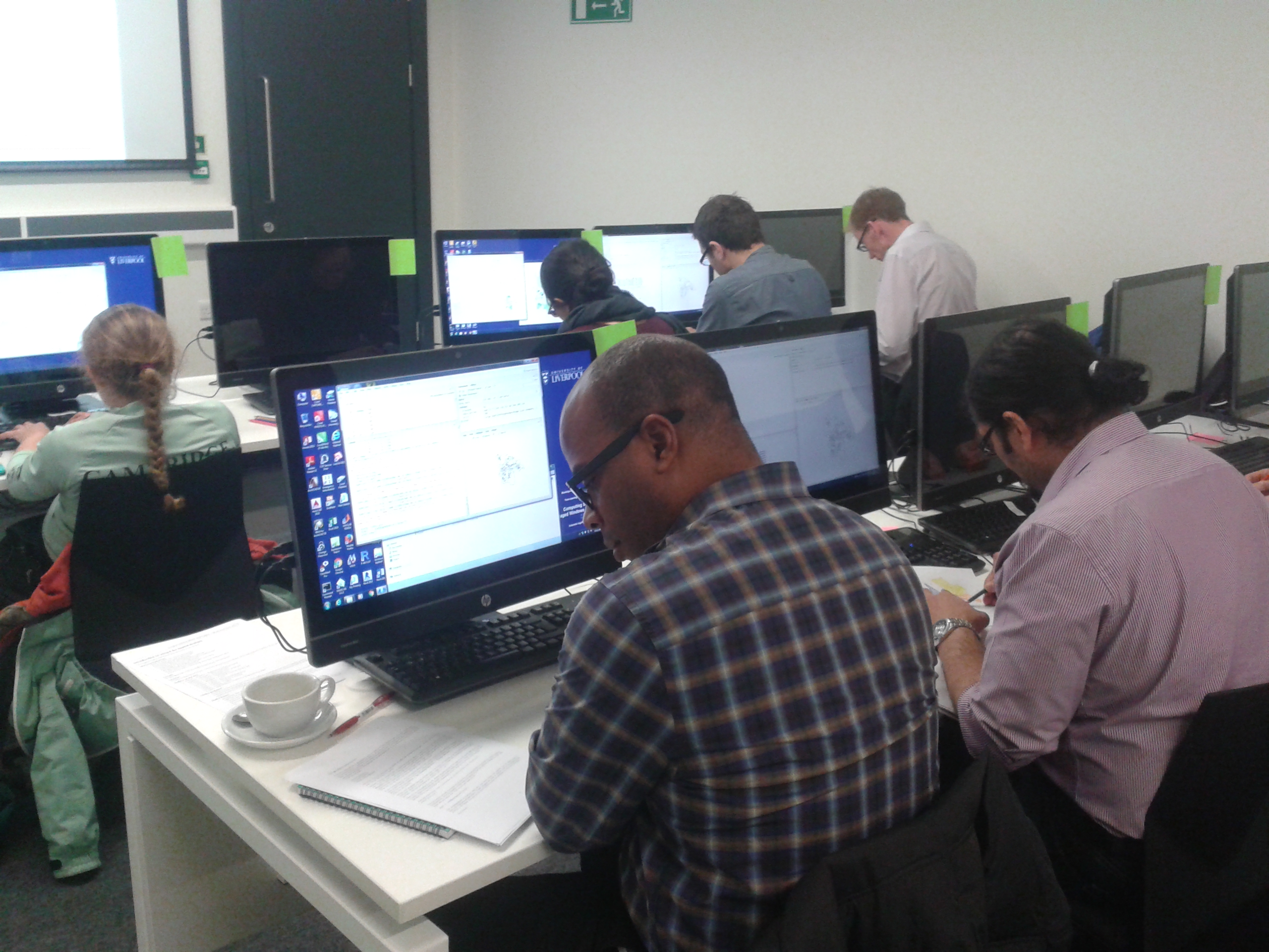
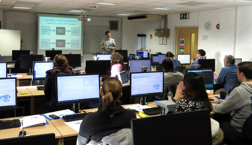
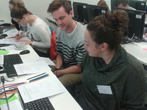
I recently ran my ‘Introduction to Spatial Data & Using R as a GIS’ course for the NCRM at the University of Southampton. This was the first time after I had updated the material from using the SP library to using the new SF library. The SF (or Simple Features) library is a big change in how R handles spatial data.

Working with RStudio at University of Southampton

Back in the ‘old days’, we used a package called SP to manage spatial data in R. It was initially developed in 2005, and was a very well-developed package that supported practically all GIS analysis. If you have worked with spatial data in R and used the syntax variable@data to refer to the attribute table of the spatial data, then you have used the SP package. The SP package worked well, but wasn’t 100% compatible with the R data frame, so when joining data (using merge() or match()) you had to be quite careful, and we usually joined the table of data to the variable@data element. For those in the know, it used S4 data types (something I discovered when I generated lots of error messages whilst trying to do some analysis!)

The SF library is relatively new (released Oct 2016) and uses the OGC (Open Geospatial Consortium) defined standard of Simple Features (which is also an ISO standard). This is a standardised way of recording and structuring spatial data, used by nearly every piece of software that handles spatial data. Using SF also allows us to work with the tidyverse series of packages which have become very popular, driven by growth in data science. Previously, tidyverse expected spatial data to be a data frame, which the SP data formats were not, and often created some interesting error messages!

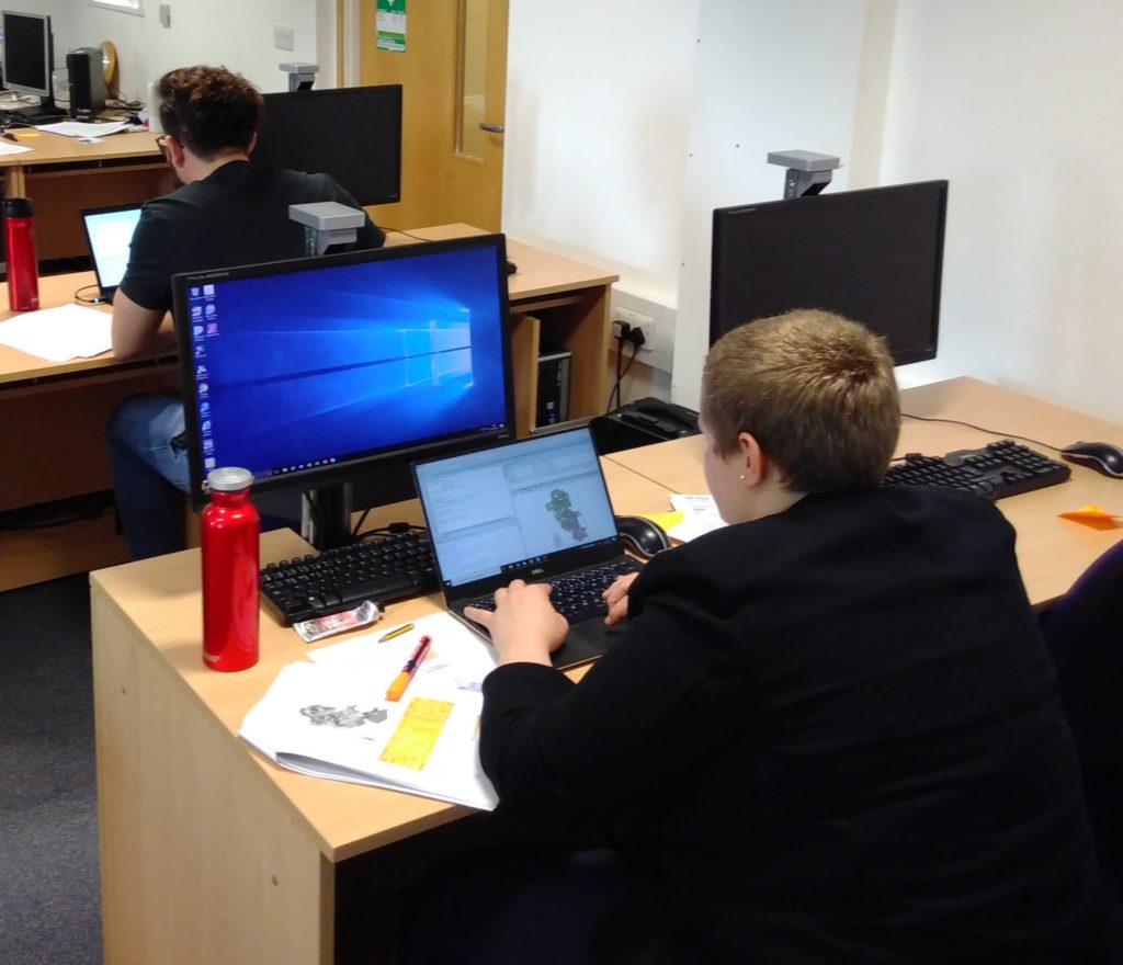
The Geospatial Training Solutions ‘Introduction to R’ course is very well established, and I have delivered it 14 times to 219 students! However, it was due for a bit of a re-write, so I took the opportunity of moving from SP to SF to do restructure some of the material. I also changed from using the base R plot commands to using the tmap library. As a result, it is now much easier to get a map from R. In fact, one of the participants from my recent NCRM course in Southampton said:

“It was so quick to create a map in R, I thought it would be harder.”

Participant on Introduction to Spatial Data & Using R as a GIS, 27th March 2019, University of Southampton

They were blown away by how easy it was to create a map in R. With SF and tmap, you can get a map out in 2 lines (anything staring with # is a comment):

LSOA <- st_read("england_lsoa_2011.shp")  #read the shapefile 
qtm(LSOA) #plot the map

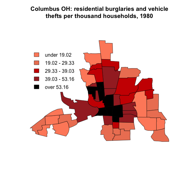
You can also get a nice looking finished map with customised colours and classification very easily:

tm_shape(LSOA) +
tm_polygons("Age00to04", title = "Aged 0 to 4", palette = "Greens", style = "jenks")
+ tm_layout(legend.title.size = 0.8)
Count of people aged 0 to 4 in Liverpool, 2011 Census Data.

However, unfortunately not all spatial analysis is yet supported in SF. This will come with time, as the functions develop and more features are added. In the practical I get the participants to do some Point in Polygon analysis, where they overlay some crime points (from data.police.uk/data) with some LSOA boundaries. I couldn’t find out how to do a working point in polygon analysis* using this data and the SF library, so I kept my existing SP code to do this. This was also a useful pedagogical (teaching) opportunity to explain about SF and SP, as students are likely to come across both types of code!

*I know theoretically it should be possible to do a point-in-polygon with SF (there are many posts) but I failed to get my data to work with this. I need to have more of an experiment to see if I can get it working – if you would like to have a try with my data, please do!

The next course I am running is in Glasgow on 12th – 14th June where we will cover Introduction to Spatial Data & Using R as a GIS, alongside a range of other material over 3 days. Find out more info or sign up.

The material from this workshop is available under Creative Commons, and if you would like to come on a course, please sign up to the Geospatial Training Solutions mailing list.

Cross-posted from
http://www.geospatialtrainingsolutions.co.uk/spatial-r-moving-from-sp-to-sf.

ESRC Research Methods Festival 2018

During the amazingly sunny weather a few weeks ago, I managed to spend a couple of days indoors, hiding from the sun at the ESRC Research Methods Festival at the University of Bath. Every 2 years, the National Centre for Research Methods have organised this conference to showcase unique and new methods from across the social sciences. The conference covered everything from ‘Multi-scale measures of segregation data’ and ‘Quantitative methods pedagogy’ to ‘Do participatory visual methods give ‘voice’?’ and ‘Comics as a research method’.

It was also fantastic to meet a range of academics and researchers who I would not normally meet. I met a number of people who I had communicated regularly with on Twitter, but never met in person before!

I was presenting in a session on ‘Multiscale measures of segregation data‘, where we were discussing different approaches to how deprivation can be measured across different locations. One of the major characteristics of grouped spatial data is the MAUP (Modifiable Areal Unit Problem), where the method used to group your data will have an impact on the results of any analysis. The session was a great collection of presentations, all of us looking at similar issues but often taking quite different methods to approach them.

I showed how using variograms based on the PopChange data set to look at spatial segregation can help avoid some of the impacts of imposing scales on the data, and instead use the data to tell us at what scales the variations are taking place.

Across the whole conference there was a range of content using scripting languages, and R and Python featured significantly across the board, to the surprise of some of the participants, including me:

Like most conferences, there were so many interesting sessions and it was often difficult to choose which track to attend! The keynotes were all thought provoking. Danny Dorling presented a range of interesting information on current levels of inequality in the UK, and warned us that it is likely to get worse before it gets better. Donna Mertens called on all of us to think about how our research can change things, and if it doesn’t, why not?

It was a great methods conference, and reminded me about how many different methods are out there. If you would like a chat about how using GIS could help with your research or work, please do give me a call on 01209 808910 or email at nick@geospatialtrainingsolutions.co.uk.

Cross-posted from http://www.geospatialtrainingsolutions.co.uk/esrc-research-methods-festival-2018/

Spatial Data and Spatial Analysis Training in Southampton

Over three days in January, Nick ran a series of one day GIS training sessions for the ADRC-E at the University of Southampton. The courses covered a whole range of GIS skills including understanding spatial data, finding GIS data, working with QGIS & R, and spatial analysis in GeoDa & R. The course participants came from a wide variety of backgrounds including PhD students; academics; health; economics; business intelligence and national statistics.

As well as plotting data on a map, the courses also covered more advanced spatial analysis, looking at buffers, spatial overlays, spatial decision making and spatial statistics. This allowed participants to get the most from their spatial data and use it in their future work.

GIS is a fantastic tool and something that can be applied in many different settings. Nick’s up-to-date knowledge and experience provides course attendees with the know-how needed to evaluate their own data, to create maps and perform the analysis within their workplace.


Photo credit: ADRC-E

“I enjoyed the focus on practical exercises – very useful! Excellent content for intro course.” course attendee, Introduction to QGIS: Understanding and Presenting Spatial Data, 15th January 2018.

We run courses across the UK, our training page provides details of our upcoming courses. If one-to-one GIS training would be useful for you or members of staff in your organisation, please have a look at our brochure or get in touch to find out more about our tailored courses for all skill levels.

Introduction to GIS and Confident Spatial Analysis, UCL, London

During a warm week in July, I spent three days at UCL in London running GIS courses in conjunction with Clear Mapping Co, the ADRC-E (Administrative Data Research Centre for England) and the CDRC (Consumer Data Research Centre). We ran three one day courses, developing the courses we had run at UCL in February. It was great to come back and increase the number of people who could benefit from using GIS and spatial data in their work.

We had a wide range of participants, from PhD students and researchers, to those working in Government, charities and a wide variety of other applications. We even had someone who was making the leap from working for a large commercial company to going freelance at the end of July – good luck!

Our colouring in exercise was a great success and really got the students thinking about how we choose the colours we use on a choropleth map, as well as how we select the classification boundaries for the data. We gave the students one data set, and the 20 students created 20 different maps. The lesson was to make sure you think about which colours and classifications you choose – don’t just stick with the defaults your GIS program gives you. They are always not the best!

During these and other courses, we found a few people who had experimented with the ggmap/ggplot2 libaries for making maps in R, in addition to the base R plot commands (which I tend to teach). I know there is quite a division between ggplot users and base plot users (see here https://flowingdata.com/2016/03/22/comparing-ggplot2-and-r-base-graphics/ for a good comparison) and while there are many pros and cons to each system, and some very good examples out there (https://rstudio-pubs-static.s3.amazonaws.com/79029_b56eaffe36ef44f29b8efc0a07d67208.html). I’ve not yet come across a pros and cons article for spatial data. Does anyone know of one?

It’s always great teaching GIS to people who haven’t used it before. There is so much potential with spatial data; for more information about the GIS courses we can offer and how GIS could be useful for you, take a look at our ISSUU or get in contact with Nick who will be able to develop a bespoke course suited to your requirements. Email Nick at nick@clearmapping.co.uk, or call 01326 337072.

Cross-posted at http://www.clearmapping.co.uk/our-blog/item/490-introduction-to-gis-and-confident-spatial-analysis-ucl-london.html.

Creating choropleth maps in R with the darkest colour at the top

I’ve just been through the process of contributing to the source code of a package in R (in a very small way) so here’s a short piece on how easy it was, and why anyone can do it! I originally wrote this post in August last year, but waited to post it until the new version of maptools was released. I missed this (we are now at 0.8-39!) and have only just rediscovered this post. It’s all still relevant though!

I have been using the Maptools library extensively in my use of R as a GIS, as well as in my teaching material (hosted at https://github.com/nickbearman/intro-r-spatial-analysis). The default plot order in the legend is to have the darkest colour at the bottom of the legend, and the lightest colour at the top. This was just something I accepted, and to be honest, never really thought about before.

I recently delivered a training course on R to some staff at the ONS (Office for National Statistics, England & Wales) and they said that their best practice guidelines are to have the darkest colour at the top of the legend. They asked me how to do this, which I didn’t know!

After some fiddling about with an R script, I created a version which worked for them. I then thought it might be useful to integrate this into the Maptools library, and emailed the package author, Roger Bivand. He was very helpful, and I added the additional code to the sourcefiles for Maptools. These are now avaliable in version 0.8-37 (or later), which has recently be released. Running update.packages(“maptools”) should get you the new version.

To reverse the colours is a simple matter of changing the legend code in two places. Using the example from the helpfile, the original line:

legend(x=c(5.8, 7.1), y=c(13, 14.5), legend=leglabs(brks), fill=colours, bty="n")

The revised line:

legend(x=c(5.8, 7.1), y=c(13, 14.5), legend=leglabs(brks, reverse = TRUE), fill=rev(colours), bty="n")

To give you some nice visual examples:

Rplot Rplot_reverse

Or for those of you who have attended my R course:

normal-order reverse-order

The file I updated is at https://r-forge.r-project.org/scm/viewvc.php/pkg/R/colslegs.R?view=markup&root=maptools (this link shows the changes), and I also updated the helpfile. If you’ve done some R scripting, then it is not too difficult to do. Any questions, please post them here. Good luck!


R for Spatial Analysis Courses in Liverpool and London

This week I have run two courses on ‘Introduction to Using R for Spatial Analysis’ which have been very successful. Both courses sold out, with 15 people attending in Liverpool and 20 in London. We had people with a wide range of GIS and R experience, ranging from no experience in either GIS or R, to significant experience in one but little in the other.

2015-12-02 11.34.09We covered the basics of using R through the RStudio interface, which I find makes R easier to understand for newbies! I certainly found it much easier to learn R using RStudio, and still use it everyday for my R work (I’ve opened the native R interface maybe twice since I started using it!). We also looked projections and coordinate systems (which were at the bottom of a GIS problem a colleague had today) and at spatial data representation, particularly how to create a representative, truthful choropleth map, and I made use of a blog post about this very issue, which I recently tweeted.

2015-12-02 11.34.21We also had a number of very interesting discussions about the pros and cons of R vs other GIS software, such as ArcGIS or QGIS, as well as other languages, such as Python. Each has their own pros and cons, and in my work I regularly use a mix of these, depending on what I am trying to achieve.

 I am also in the process of developing an intermediate course that will focus more on spatial analysis. If you are interested in finding out more about when either the basic or the intermediate courses will be run again, please send me a message (using the contact form on this site) and I will add you to a list to hear about future courses.

All of the material from this course is freely available, and hosted on GitHub. Head over to http://github.com/nickbearman/intro-r-spatial-analysis and you can view the material yourself and work through it at your own pace. You can even use it to contribute to new teaching material, and if you do, please also make your material available through Creative Commons so others can benefit from it as well.

Cross-posted at http://geographicdatascience.com/blog/training/R-for-Spatial-Analysis-Courses-in-Liverpool-and-London/.