We finally have an end date for ArcMap! This has been something that has been a long time coming, but I would say is certainly due now. ArcMap final date of support for software updates and patches has been announced as Feb 2024. ESRI launched ArcGIS Pro, the replacement for ArcMap, several years ago and people have been slowly transitioning.
ArcMap holds a special place in my heart because it is the software that I learnt GIS on. I first came across it in my undergraduate Geography degree at University of Leicester in 2003 – introduced to me by a certain Prof. Nick Tate if I remember correctly. This was the first time I had come across the combination of Geography and Computer Science and the subject suited me down to the ground.
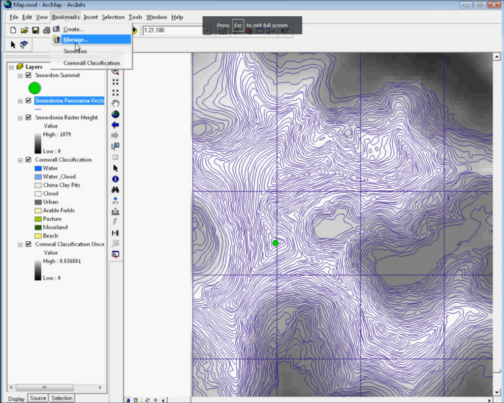
Later on, I also spent a lot of time working with ArcMap 9.2 (above), which I used in my programming skills to use VBA (Visual Basic Applications) code to create a map that made sounds – an area called sonification, which formed part of my early research interests.
Things have certainly changed in the 20+ years since 2003. ArcMap itself progressed from version 8.3 all the way up to the now retiring version 10.8.2. Of course we have also seen the rise of open source: QGIS in particular as a competitor to ArcMap, and now potentially better than ArcMap or ArcGIS Pro, depending exactly who you are and what you are trying to-do.
We’ve also seen the rise (again) of scripting. With R leading the way and Python a performing a quick catch-up, the combination of easier to use software and ease of access to the benefits of scripting has seen GIS become much more accessible than it was 20 years ago. Some colleagues who have been using GIS longer than I have remember the days of AML, ArcInfo and Sun Microsystems – all of which used command line interfaces to work with data. Much of this was to handle larger data sets than was easy to do in a graphical interface with limited computer resources – much the same situation we see now with big data and bigger computers – but still with limited computer power to process that data.
I was saddened to hear that some students are still being taught ArcMap:
For anyone teaching GIS now, ArcMap is not the tool to teach. It has been a long hard road of transition from ArcMap and I know moving software is not easy, but if anyone is still teaching ArcMap, I very much hope this is its final year. Of course anyone who would like help transitioning, ESRI provide a range of very good materials and I also have good consultancy rates – just get in touch!
One constant challenge in the geospatial environment is that the tools and technologies constantly change – and we see this across the board of geospatial. My advice to anyone coming into this area is to at least keep up with the changes and have an idea of what is happening, even if you don’t use the cutting edge in your own work. Much of GIS’s power is in its versatility and you can get 80% of this benefit with only learning 20% of the tools! Also that 20% of knowledge will easily transfer between QGIS, ArcGIS Pro, online web maps and many other GIS.
I’m really looking forward to the next 20 years, and who knows what it will hold?!
A couple of weeks ago I spent a fantastic week in Cape Town, South Africa, attending the 2023 International Cartographic Conference. The ICC (not to be confused with the International Cricket Council!) is held every two years by the International Cartographic Association (ICA). It’s a global conference, and this is the second time it has taken place in South Africa, previously being hosted in Durban in 2003.
The conference covers everything under the umbrella of Cartography and GIScience, with papers ranging from user assessments to theoretical discussions, covering topics as wide as cartographic methods, generalisation, COVID, navigation, education, spatial data infrastructures and many many other topics. There is plenty of overlap with the Cartography and Geographic Information Science journal (CaGIS Journal), and a number of us from the academic board were attending to present our work, connect with authors and discover new articles. I work as Cartographic Editor for CaGIS, and it was great to see some published work presented, and discover new authors who might write for the journal.
3D Models
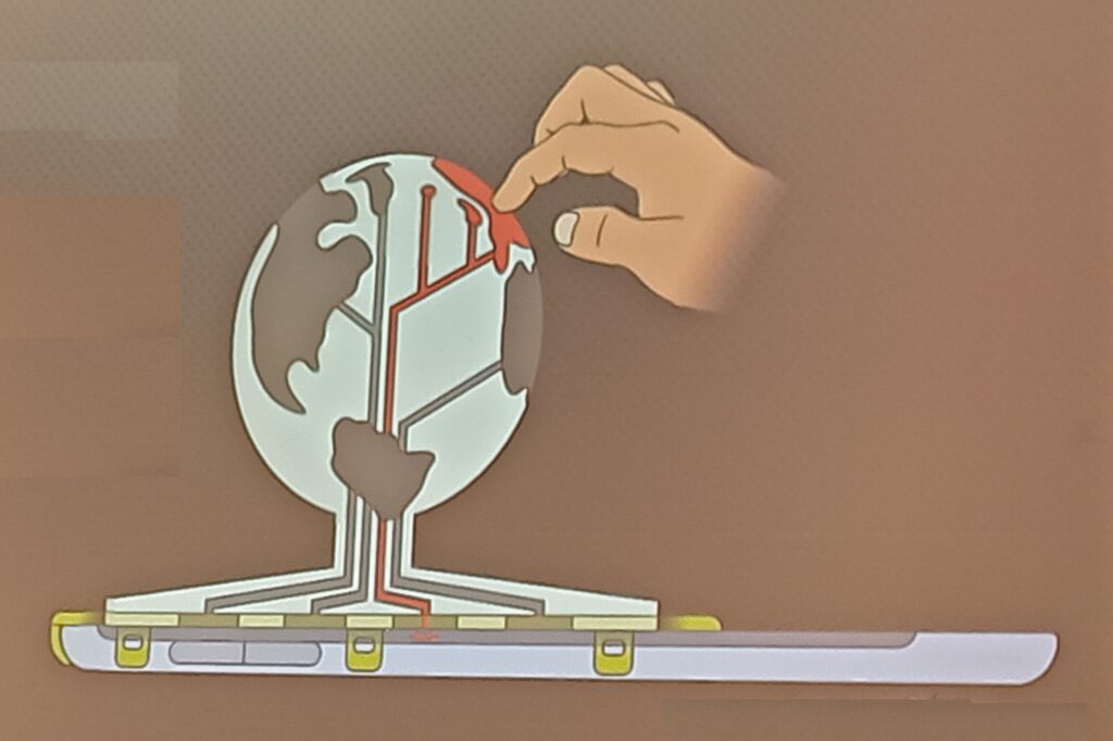
I was particularly impressed by work developing methods to provide 3D models with interactive elements to people who are blind or visually impaired. Jakub Wabiński developed a 3D printed tactile model which has been published in CaGIS and Jan Brus and Radek Barvir presented a process to 3D print models with conductive elements so users can press on certain locations which then prompts a mobile phone to play a verbal recording describing that feature.
The 3D model uses conductive strips to link the touch on designated areas of the 3D model to the tablet underneath, which then pays the relevant audio narration. This allows many different relatively cheap 3D printed models to be used with one tablet.
UN Acronym Soup
The ICA is quite a large organisation with a long history, and has good links with a number of United Nations (UN) groups and initiatives, including UN GGIM – UN Committee of Experts on Global Geospatial Information Management and UN IGIF – Integrated Geospatial Information Framework. The IGIF is a multidimensional framework that provides countries with a basis for developing, integrating, strengthening, and benefiting from geospatial information management. There is a risk of drowning in acronym soup when it comes to working with the UN, and I had some great discussions when asking a number of people how UN groups and initiatives like GGIM or IGIF have made an impact in the real world. I had a range of different answers, from ‘I have no idea!’ to ‘having these programmes is better than nothing, so they probably have some impact’ to some much more detailed responses (see below).
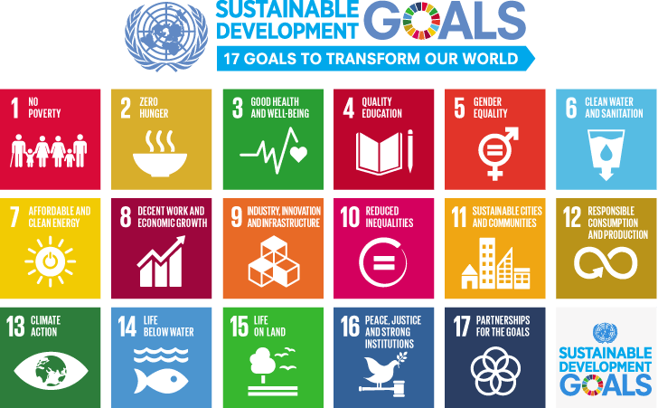
To me, it was certainly clear that the UN could do a better job of explaining what it is doing in the area of geospatial in a way that can be easily understood. However, there are some great outputs from a variety of UN departments. Firstly, there are the Sustainable Development Goals, which is probably one of their most well known activities:
These are something many people have heard of, and provide a series of targets to help all countries develop sustainably. Many others can describe them better than I can (see the UN, Concern, one of the keynote presentations at the conference from Greg Scott and even Google) but one striking image is the discussion of how to measure the progress in achieving these goals, and the fact that for a number of the goals some countries are actually going backwards. Managing the data for these is a key issue, and a number of goals are quite difficult to measure, with some countries not having the data to be able to measure the progress (or lack thereof). It is possible that in comes cases this may be deliberate (for example, China reducing the number of statistics they publish because they were showing a bad message) but I think in most of the cases it is because a) the goals are tricky to measure and b) they often require specific resources which may not be available.
Returning to UN GGIM & IGIF, accessibility of data is one of the key focus areas of the UN GGIM. One of their core aims is helping all countries develop their spatial data infrastructures, that is the national organisations that manage, maintain and make accessible their spatial data. The UN IGIF is a framework that will help countries in this process – highlighting best practice and examples of how to do this. Of course every country is at a different stage in the process, but from discussions at the ICC, every country is keen to progress their work.
Gobe Hobona from the OGC (Open Geospatial Consortium) gave me a very good explanation of IGIF, which formed part of the description above. He also compared it to INSPIRE, which is the European Union (EU) initiative on spatial data infrastructure, and is probably 10-15 years ahead of IGIF. INSPIRE has provided a framework for structuring spatial data and metadata across the EU, and therefore making data (including spatial data) much more accessible by providing information about it in a structured way. Similar initiatives exist in the UK, for example on the data.gov.uk site – you can search for many different UK government related data sets there, and one of the key underpinning structures is Gemini which makes this possible. More specifically, the Gemini standard is a profile of the ISO 19115 standard that facilitates conformance to INSPIRE metadata implementing rules. A common thread across many of the geospatial data initiatives and frameworks is that they make use of OGC Standards.
Mapping for a Sustainable World
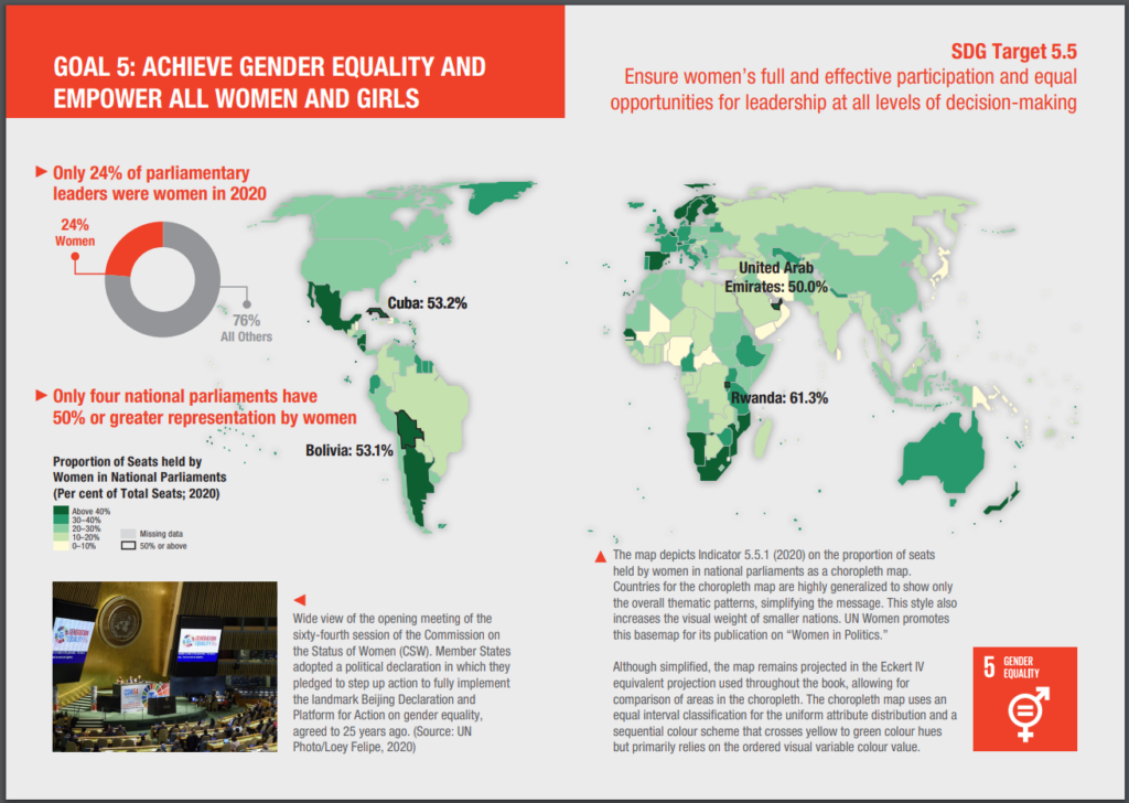
Another great output from the UN is Mapping for a Sustainable World, which is a fantastic publication from a collaboration from the UN and the ICA (ICC). It’s a free book, available as a PDF, covering two main aims. Firstly, it discusses how maps can be used to help monitor progress across all (13) sustainable development goals, for example Goal 5: Gender Equality.
As well as discussing the availability of spatial data, it also covers practically every key aspect of working with spatial data and GIS (projections, MAUP, classification, scale, generalisation, colour, typography and so on), it also gives examples of 14 different types of map (thematic, nominal, choropleth, etc.) and discusses different environments for map use (both in terms of audience and medium).
I was fortunate enough to meet one of the co authors, Britta Ricker, at the CaGIS reception, and heard about some of the challenges in pulling this book together, including methods that are not well known, but potentially very useful (e.g. dasymetric mapping), and UN’s approach to boundaries (e.g how to show disputed areas such as Tiwain, Crimea, Israel/Palestine, etc.). This is a well known geographical issue, as discussed shown in MapTiler, Google, Apple Maps, and even as discussed by James Cheshire on Christmas decorations! The UN also has a standard detailing these issues, as well as maps people can use themselves, including officail UN boundaries in their web maps.
As well as seeing a wide range of presentations across the whole range of Cartography and GIScience (let me know if you’re interested in publishing in CaGIS!), it was great to meet and network with a whole range of people passionate about cartography and GIScience from around the world. This conference also included a record proportion of attendees from both the African continent (450 and South Africa itself (385), which was fantastic to see (stats from map of attendee home country on https://icc2023.org/). A number of those I spoke to said they would be unable to attend if the conference was outside Africa due to funding restrictions, so it was great for them to have this opportunity.
View from the Queen Elizabeth II Conference Centre, location of ESRI UK AC
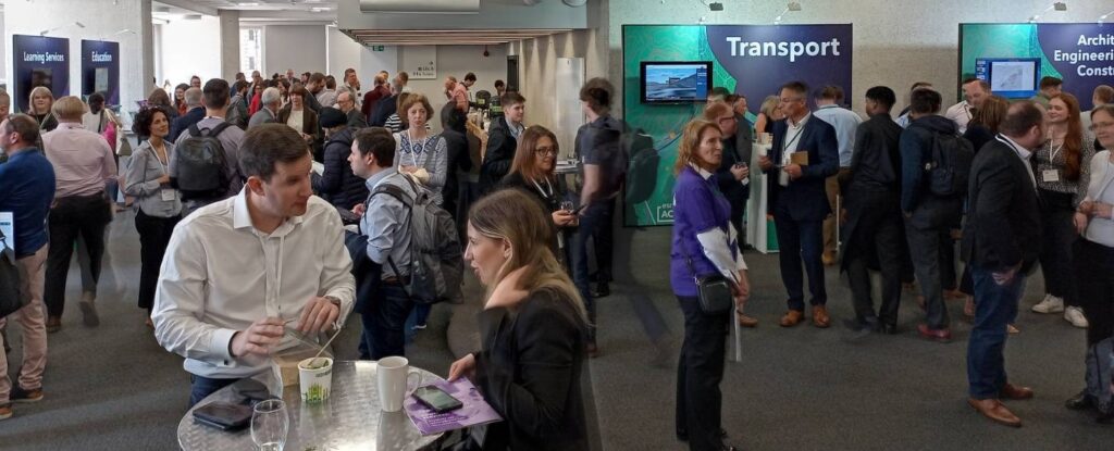
Along with many other people from the geospatial community, I was up in London earlier this week for ESRI UK Annual Conference, GeoBusiness and Spatial Data Science Conference. It was a great couple of days, and while I didn’t manage to attend everything (limited time, money and energy!) it was great to see and hear what I did.
ESRI UK’s Annual Conference had a couple fewer streams than usual, but it was still as busy. I also managed to get into one of the over subscribed training sessions, to see what had changed in ArcGIS Online recently. Digital twins were mentioned quite a bit, developing from my blog post about last year’s conference, and the vocabulary is evolving and the focus has now shifted to how they are actually useful.
Jurassic Fibre gave a great presentation about how their as-built survey validation process made use of in field tools to collect and verify data. They were comparing what was planned to be built against what was actually built, and had some great processes for managing this. It really shows not just how important data is, but also how important how linking different teams together is important to deliver a service.
Discussions and catching-up at ESRI UK annual conference
I also had some really useful discussions about sharing data between platforms – some people use ArcGIS, some use QGIS, some R, and so on. Everyone has good reasons for using the software they do, and it would be a hard struggle to get everyone (in a team, group or even organisation) to use the same software – and more often that not will be a waste of time. What can be done is to help everyone make use of the same data, and / or share data in exchangeable formats.
Accessibility also had a focus in the end keynote presentation, combined with ChatGPT. Large language models create great potential for interacting with maps and spatial data in a different way – a prototype demo showed how a user could verbally ask for information about a map, and the computer could give a verbal summary. No where near production yet, but it shows what could happen. There is a huge amount of potential here – with developing better interfaces for those suffering from visual impairment – or for better natural language interaction with maps. This linked a bit in with my PhD work, from 2008-2011, focusing on sonification, where I used sound to represent data in combination with vision. There are some videos and code demonstrating this (I’m sure the VBA code in ArcMap will no longer work, not the Google Maps API code, but the videos how how it worked!), as well as my PhD thesis itself.
Sonification – from a few years ago 😉
Will ChatGPT replace GIS Analysts? I don’t think so, so we will all still have jobs! It will certainly change what we can do, and some jobs will change. With any LLM, you need to know how to ask the right question as well as being able to understand the answer that comes back. Ultimately the skills will be in interpreting the results, and making a judgement call about whether it is useful or not. Google revolutionised the internet when it was launched – and LLMs will be no different. As ever, we always need to be critical of maps and spatial analysis output – and ChatGPT or Bard or any other LLM will not change that. If anything, it will make it more important!
“So don’t just use GIS, but use it critically.”
I also popped into the Spatial Data Science Conference party in Wednesday night, and it sounds like the conference was fantastic – next time perhaps!
GeoBusiness followed ESRI AC UK, with a huge range of geo related businesses hosting stands and presenting talks. The stands were very equipment focused, with many new drones and surveying tool available to have a look at and discuss. However I was more interested in the talks and networking opportunities. The skills shortage was again raised as an issue, with not enough people available with geospatial skills. However speaking with those at the coal faces, new graduate with geospatial skills are being tempted away with starting salaries of £5k – £10k more for similar roles outside geospatial (e.g. programming) and even more for data science roles. It’s a hard ask for someone to give up £5k – £10k a year to stay in geospatial!
Developing skills of people coming into geospatial is something that is of particular interest to me, with a range of initiatives around training and skills development. While many users are big ESRI clients, there is certainly an increase in people wanting to use ESRI along side open source solutions – particularly QGIS. I see lots of potential for North Road’s SLYR tool, what they term: the ESRI to QGIS Compatibility Suite.
There are so many novel applications of GI data and one in particular caught my eye – ClearSky, a product from Aspia Space, have created a AI algorithm which converts uses cloud-penetrating Synthetic Aperture Radar (SAR) data to create cloudless multispectral imaging, right across the visible and short-wave infrared spectrum. This allows a ‘cloud-free’ view of satellite imagery – an interesting and valuable resource.
A different, but potentially equally useful application of GIS data was presented by Christopher Jackson from Advanced Infrastructure talking about geospatial tools for energy. They have created an application to help local councils estimate where it may be viable to install electric car charging points. The GIS analysis itself is not that ground breaking, as they are looking at a combination of IMD data, street width and electricity supply provision data to estimate feasibility and cost of electric car charging point installation – but the fact they think this is worth building into a product that can be sold is. It shows how vital geospatial data is and reminds me of the fact that there are still many people out there who don’t know what geospatial is. Communicating this is one thing we could all do better at.
It was great to see so many people, and chat about upcoming projects and opportunities, including FOSS4G:UK 2023 – watch this space(s) for more details soon: OSGeo:UK!
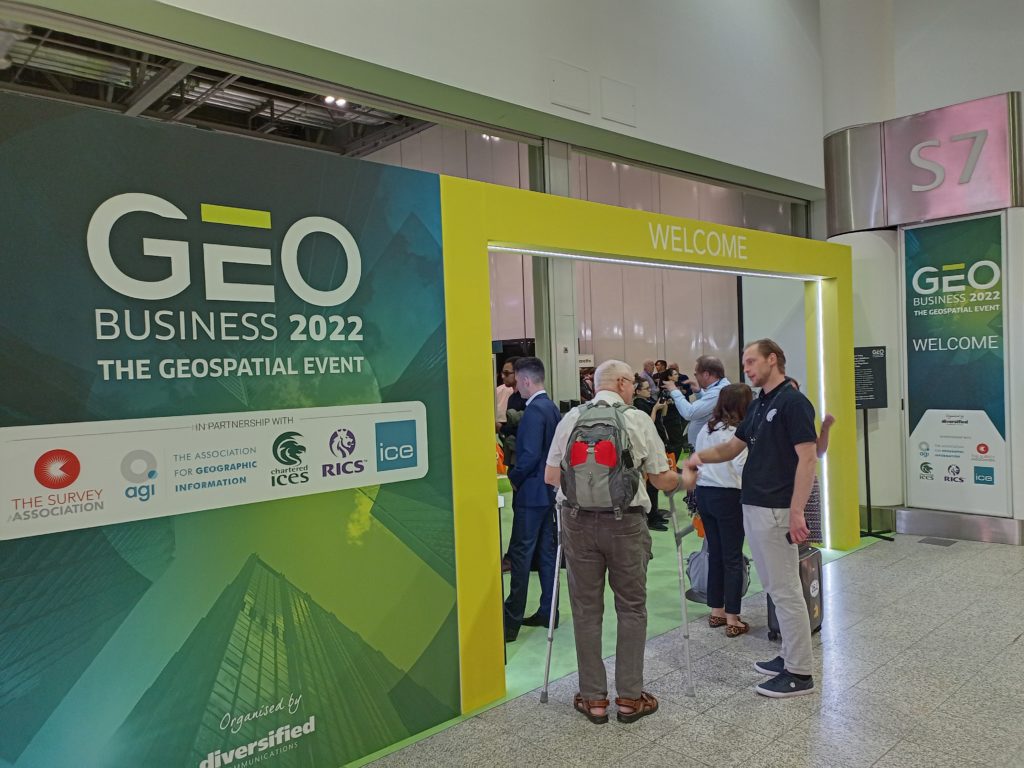
Last week I attended the first ESRI UK Annual Conference (17th May) and the first GEO Business conference (18th & 19th May) for three years (although GEO Business had a conference last autumn, which I didn’t manage to attend). It was great to be back at the Queen Elizabeth II Centre for the ESRI UK Annual Conference – it is always a great opportunity to meet colleagues working in GIS in the UK across all industries. Clearly open source didn’t feature that much (!) but all of the ESRI tools were showcased and it was a great opportunity to see what is coming up over the next year.
ESRI UK Annual Conference at QEII Centre, Westminster, London
Sustainability was the key theme of the conference, “GIS – Creating a Sustainable Future”, with the Met Office delivering the keynote focusing on climate change. I actually missed their presentation (a long train journey!) but hearing from other participants it sounded a good presentation, although there was the question of how we turn talk about climate change at the conference into action that makes a real difference in the world.
ESRI were very keen to push the ArcGIS Suite as a set of capabilities and focusing on what you can do with their tools, rather than the tools themselves. Highlights include new graph data structures now available in ArcGIS Pro, the versatility of LiDAR data and ArcGIS Image for ArcGIS Online, ESRI’s response to Google Earth Engine allowing processing of large satellite data in the cloud. On that note, ArcGIS Online was first launched ten years ago – which was a slight shock to many attendees! It has gone from strength to strength – and I do like how the ArcGIS products have made GIS more accessible to new users.
ArcGIS Hub also featured prominaty as a way of collating information and making it avaialbe to non-GIS users. We also heard about deep learning models being features in the Living Atlas, real time vechicle tracking (although interestingly no mention of ethics), and greater links with AutoDesk billed as ArcGIS GeoBIM. ESRI are also very keen on pushing greater use of the cloud – either provided through ESRI’s owns services, or, longer term, hosting the various ArcGIS products on the cloud yourself. We saw a great semo of ArcGIS Geoanalytics running a Python Notebook on databricks.
Finally, we had various mentions of ‘digital twins’. I remember the last GEO Business conference I went to in 2019 there was a lot of talk about digital twins, but nobody had actually created and used one. Now, a number of people have. One example was a model of buildings in London including information on how much water might be needed by the fire brigade to extinguish a blaze in a specific building and whether the water supply network could supply the needed amount of water. A few people weren’t convinced these were digital twins – as the key definition of a digital twin is that it includes real time updates. However, ‘real-time’ depends a bit on what temporal scale you are working to – and the amount of water needed to extinguish a blaze in a specific building probably wouldn’t change that much – so I think this is very case dependent.
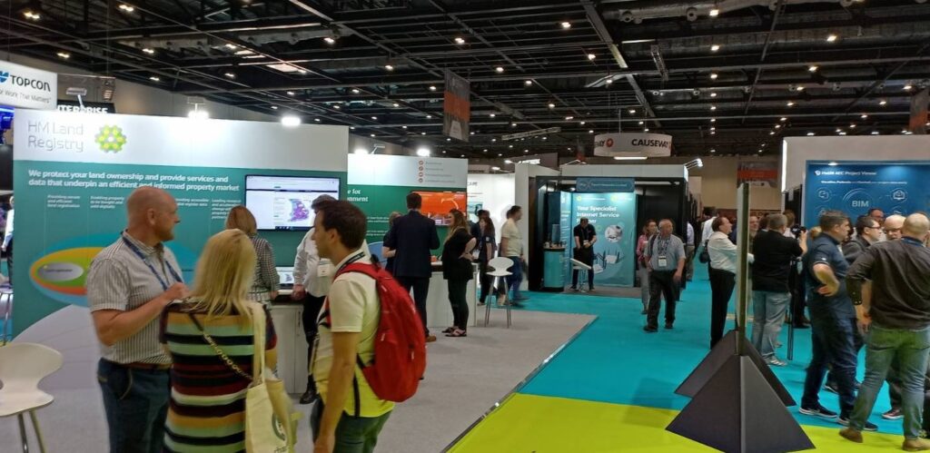
GEO Business 2022 at ExCeL, London
I also attended the GEO Business conference out at ExCeL on the following day. Again, this was a great networking opportunity, although with a slightly different subset of the geospatial community. I went to a couple of very interesting applications talks – including one from the Met Office by Anthony Veal, who was working on a pilot project to increase the rated capacity of overhead electricity lines depending on the weather. Currently, overhead lines are rated for their maximum capacity based on a worse case weather scenario, which is rarely reached. Heat is the main limiting factor on the lines, with wind being the primary mitigating factor. This project is working on moving from a static worst case scenario limit to dynamic limits based on the current wind conditions. It is still in relatively early stages, with one case study, but shows a potentially significant increase in capacity at certain times. This, arguably, could be considered a digital twin with its’ real time data but the Met Office didn’t use this term.
Doug Specht also gave an excellent talk on Teaching Geospatial Ethics, and how he approaches this with his audience of students who are not geographers, but are often asked to create maps. He summarised the issues as a very nice three principles:
No visualisation is neutral
Platforms have politics
All perspectives are partial
This works very well for this students – journalists, writers and communication – and works as a great first step before looking at geospatial ethics frameworks like the Locus Charter.
Cloud processing also cropped up a lot at GEO Business, with many of the companies, large and small, offering new cloud based services for working with LiDAR point clouds, aerial photos and drones. There was also a nice expansion of engaging others with GIS and highlight how useful it can be across all professions – something I strongly believe in and see every day.
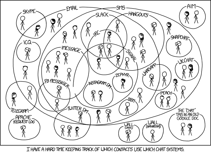
I’ve recently come across a new piece of software that could revolutionise communication – and yes, you have probably heard that before, in many articles on the Internet! However this one might actually be useful (although maybe not revolutionary yet), and be a significant improvement on the many different systems we have for instant messaging (IM). At the last count I regularly use Teams, Slack, WhatsApp and Signal and also sometimes use texts, Skype, Facebook Messenger, Telegram for IM, and there are probably some others I have forgotten as well.
This is really helpful, to avoid situations like this:
Matrix is something that might be able to replace all of these, and bring them into one interface, so you can have all of your IM communication in one piece of software. Matrix is an open source, distributed protocol for instant message communication. It’s a bit like email, but for IM. The email analogy works really well – because Matrix is the protocol (like email) and you can get many different clients, like you can for email (Outlook, Thunderbird, Gmail, …). You also have a Matrix address, much like an email address.
Within Matrix you also can have specific chat rooms (think like Slack Channels, IRC rooms, Teams teams, etc.) as well as 1 to 1 messaging. The big advantages for me are that it is open source (the only open source option for this, I believe) as well as being end-to-end encrypted. It also has bridges which allow you to join in other platforms from your Matrix account, and this is the big thing for me. Now when people send me messages in WhatsApp, Signal, Teams, Slack or anywhere else, I can a) actually find their message easily when I hear a sound and b) reply to it all in one place!
The other key bit of the puzzle is the client. I use a program called Element, which is one of the main clients for Matrix. There are others available as well, and you can use whichever one you like. You can also switch between platforms and all your messages and rooms you have joined will still be there.
The Element interface
This is my Matrix address: @nick:nickbearman.ems.host and if you go to https://matrix.to/#/#nick:nickbearman.ems.host in your web browser, this will open up the (Matrix) client of your choice (Element by default), give you the option of signing up for an account on Matrix and then allow you to send me an instant message.
You can also join rooms in a similar manner, e.g. the recently created OSGeoUK chat room on Matrix, to discuss Open Source Geo things: https://matrix.to/#/#OSGeoUK:matrix.org. If you are in to open source Geo, please join us there!
*For bridging to other environments, you need admin access in Teams / Slack to set this up, which requires the organisation who admins the system to allow you to use the bridges on their system!
(Apologies to anyone who has studied English Literature, at any level!)
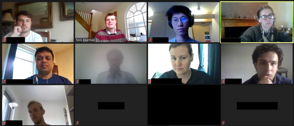
With nearly everyone participating in more and move video calls, “to share video or not to share video” is, indeed, the question. When participating in an online conference, should the audience members share their video?
We have all attended loads of video conferencing calls over the last 15 months, and I’ve been no expectation to this. I attended two conferences recently, and one thing that struck me was whether the audience members have their cameras on.
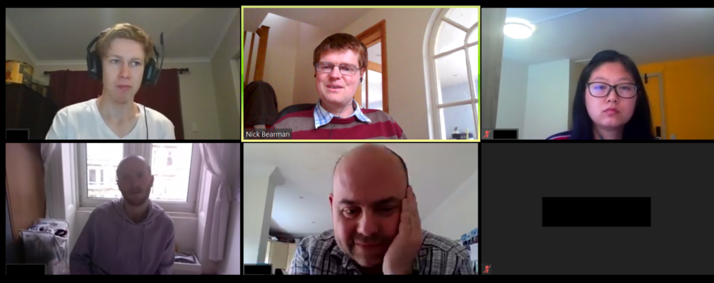
When I’m running a training course or presenting, I really love to be able to see people’s faces – so I can see who I am talking to. Of course, I realise this isn’t always possible or something the participants want to do (either because of bandwidth limitations, not having a suitable home environment [although this is less of an issue with virtual backgrounds now] or many other reasons). Therefore when I am running a course I explicitly say at the beginning: “If you can have your video on and would like to, please do. I really like to be able to see people. However if you have limited bandwidth, or another reason why you don’t want to share your video, that is fine as well.” With this approach 9 out of 10 people usually put their video on and it makes it a much better experience for me (and, I think for them).
Participants in one of my training courses sharing their videos
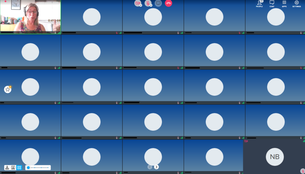
I recently attended two conferences (AGILE 2021 and Coding in the Open), where only the people presenting shared their video, and the attendees did not. There have been many conferences like this, and at some conferences attendees do not have a choice (e.g. if you are using Zoom Webinar, the audience can not share their video).
However for these conferences, there was a choice (AGILE used a standard Zoom room, and Coding in the Open used Bluejeans). For AGILE, the organisers asked participants to turn on their cameras for a group photo! About two-thirds or so of people did turn their cameras on the for photo. However as soon as the photo was done, people turned their cameras off again.
There seems to be an unwritten rule that the audience have their cameras off, and I have seen this is many other conferences as well.
The blank boxes (with names and initials removed)
Personally, I don’t really like this, as all you get to see of the other people on the call are black boxes. Yes, you can turn off the blank boxes, but if I am presenting, I like to be able to see who I am presenting to, and if I am in the audience, I also like to see who the audience are.
The other conference I attended was Coding in the Open, and this was run on Bluejeans. Here the attendees were asked to turn of their video because of bandwidth. This is often a worrying concern, and here around 150 had signed up for the free conference, and the organisers were very worried that 150 people joining the call with video might stretch the limits of the platform. In the end, typically we had 40-50 people in each session, so wouldn’t have been an issue.
This is a very common concern for organisers, and compounded by the fact that for free events, often only one third or one half of the people who sign up actually appear. The question then is how much capacity do you need for this event, with additional capacity often costing more money. This is a discussion for another time though.
I did a rough show of hands in the session, and it seems most people would prefer to see the audience, whether they are in the audience or the presenter. Additionally, most programs have the option of hiding the video of other participants, if that is what you prefer.
As an aside, it is worth mentioning that you can turn your own video off in most platforms, and apparently this has been shown to reduce tiredness. I’m not sure it makes a lot of different for me, but for some people it clearly does:
Now that you can remove the icon video of yourself in Google Meet I am finding online meetings far less stressful. Seeing myself (however small on the screen) for the last 15 months has been horrible. I am happy to have my video on + be seen, but not as a mirror back onto myself
— prof jenny pickerill (@JennyPickerill) June 9, 2021
So if you think it might help you, give it a try!
I guess as we work out what the ‘new normal’ is, we will be creating new social rules and expectations for how we work, including in video calls. I would say please do share your video if you can – whether you are in a call of 2, class of 25 or lecture hall of 200. I think it makes all the difference to the person presenting!
Do share your experiences in the comments below and let me know what you think.
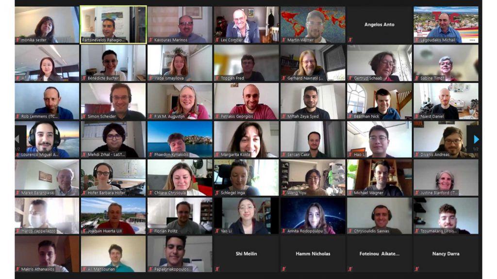
We had a great GISRUK conference this year. We were online again (as we were in 2020), because of Covid-19, with Scott Orford at Cardiff University hosting, we had a really smooth running online conference. There was a very strong field of submissions, with 24 short papers and 43 long papers being presented, with a significant proportion being presented by Early Career Researchers. The papers themselves and the recordings are all available on the GISRUK website. Attendance was also very good, with typically >100 people attending the keynotes and >50 people in each of the presentation sessions.
Attendance at GISRUL was very good
I coordinated the Early Career Workshop sessions before the main conference, and while I am biased, I think they went really well, and the ECRs who attended said they were really useful sessions. The main sessions were on Zoom, and we also experimented a bit with the Wonder.me platform for a quiz and networking, which worked really well.
Quiz and Social on Wonder.me
As ever with GISRUK we had an incredibly wide range of topic presented, from new spatial methods to big data, spatial inequalities and participatory GIS. Uber’s H3 hexagonal grid appeared several times, being a really useful new geography for many types of analysis. One of the big positives is the fact that indexing is a lot easier when working with this geography. It was also great to see presentations from the commercial sector, including Tomas Holderness from AddressCloud, presenting on their work with serverless infrastructure.
GISRUK awards prizes, and this year I managed to actually see most of the winners – parallel sessions makes this a challenge, and there have been years I haven’t seen any of the winners! This years winners were.
Best Long Paper: 23 Naturally Urban? Tackling Inequalities in Urban Greenspace and Wellbeing, by Victoria Houlden
Best Short Paper: 53 Georeferencing historical telephone directories to understand innovation diffusion and social change, by Nikki Tanu, Maurizio Gibin and Paul Longley
Best ECR Paper: 65 Do we need legends? An eye tracking study, by Jess Hepburn, David Fairbairn, Philip James and Alistair Ford
Best ECR Paper: 48 Geo-information tools for stakeholder engagement in environmental decision-making: “best practice” recommendations from a UK case study, by Caitlin Hafferty, Robert Berry and Scott Orford
CASA Prize: in the memory of Sinesio Alves Junior Prize, 38 Profiling the Dynamic Pattern of Bike-sharing Stations: a case study of Citi Bike in New York City, by Yunzhe Liu, Meixu Chen, Daniel Arribas-Bel and Alex Singleton
The papers from GISRUK are also now available on Zonodo, a long term repository where all GISRUK papers will now be kept. The presentations were also videoed, and the recordings are now available. Next year University of Liverpool are hosting GISRUK, and hopefully we will be back to an in person conference then! Looking forward to seeing you there!
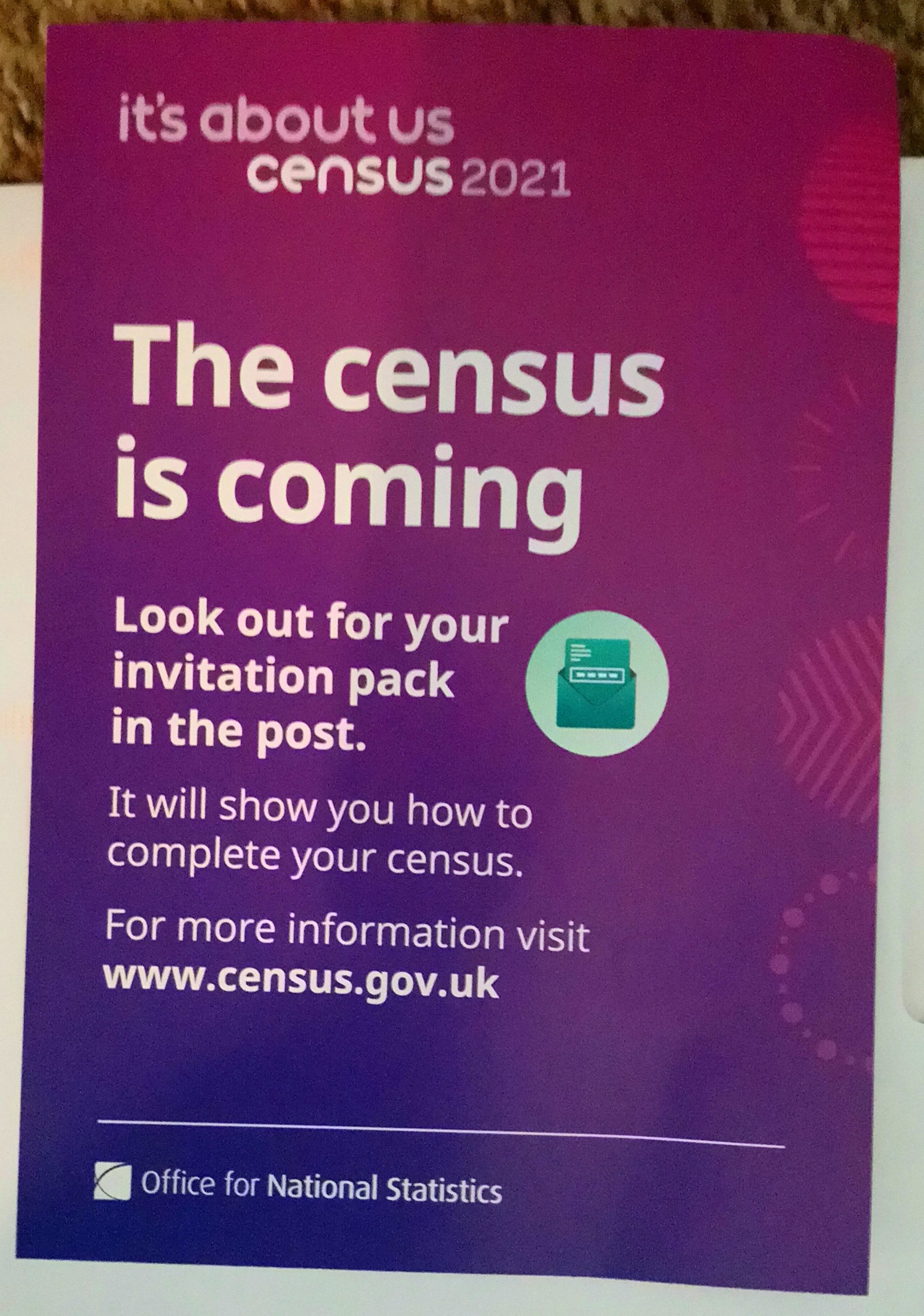
In England, Wales and Northern Ireland, we should all now have received either a letter with a 16 digit code or a paper form to fill in for the 2021 Census. There are lots of great reasons why we should respond to the census, aside from it being a legal requirement. Among other things, it’s a good way to help provide an accurate snapshot of your community, which means people will get the services they needs at a local level. The Conversation and the Royal Geographical Society (with IBG) have both posted more information about what the census is and why it is important.
The census is a fascinating data set that’s vital to many areas of research and government decision making. It provides us with a count of the population, but also a wide range of demographic data like age, gender, family relationships, socio-economic information, ethno-cultural background, health, and some voluntary questions, including religious identity and sexuality.
This is the first census that most people will be asked to complete online. However, some have received paper forms through the post, while others have just received a letter asking them to fill in the census online. Though the mechanics of the census may appear complex, the reasons why are actually quite straightforward.
So who gets a letter, who gets a form and why? The Office for National Statistics (ONS) (which is coordinating the census) has tried to determine who gets what by assessing which households are likely to find it impossible or more difficult to respond to the census online. These households (around 10% of all households) have been sent a paper form. Everyone else has received a letter with a code, asking them to complete the form online (however, it’s important to note that if you received a form, you can still respond online and if you got a letter, you can request a paper form if you want).
Online or by post?
There are a number of good reasons for filling out your form online – it saves the ONS time and money when collating the results and means we can get more accurate data.
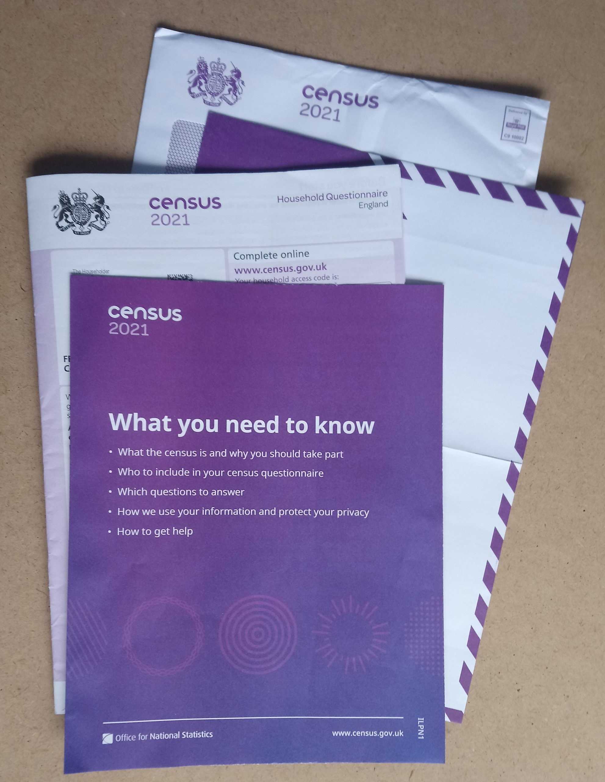
The 2021 Census form
You might be thinking: “what about my Aunt Muriel who received a letter? She doesn’t use the internet, why hasn’t she got a form?” This is because the ONS doesn’t know who’s able and willing to submit the form online – they can only model this based on the data they have.
As statistician George Box said: “All models are wrong, but some are useful”. This means that while the ONS has modelled who will (and who will not) respond online, even if they get 95% of people in the right group, there will be some errors.
There’s a term for this in the field of Geographical Information Systems (often shortened to GIS, the systems and tools we use to manage and analyse location data) – an ecological fallacy. This means that there will be cases which contradict the ONS’s model. For those who the ONS has deemed unable or unwilling to complete the census form online, there will be some who don’t fit this criteria and vice versa. This is why the ONS has included a code on the forms. If you know someone who needs a form, but is having problems requesting one, you can request one on their behalf.
The hard to count index
How did the ONS model this information? The ONS created a “hard to count” index to measure who might not respond to the census (also used for the 2001 and 2011 censuses). However, the 2021 census is different as this is the first time it’s tried to do a census “online first”, which means the ONS also had to include the digitally excluded into its index.
The key data used to drive this was internet access data from Ofcom, mobile internet connectivity (also from Ofcom) and information on who has already interacted with government websites (such as via the DVLA and HMRC). This data was used to create an area-based model, with each area assessed as either being able to complete the census online, or needing paper forms. Each area contains about 1,500 people and are known by the ONS as LSOAs (lower layer super output areas). This was tested and refined together with many other aspects of the census in the ONS’s big rehearsal for the census in 2019. There are lots more details in their report EAP102 Hard to Count index for the 2021 Census.
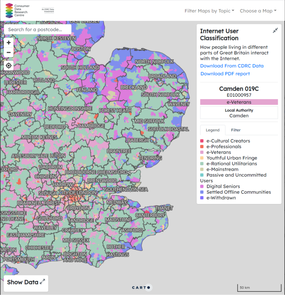
Internet User Classification
While ONS have not published their Hard to Count index, they have shared it with Local Authorities to help them target their census engagement work. A similar example looking at who is digitally excluded is the Internet User Classification, created by the Consumer Data Research Centre, open and freely available for anyone to use. Here, they looked at a range of factors (including internet connectivity and usage) and created a geodemographic classification identifying who uses the internet (e.g. e-Cultural Creators, e-Professionals) and who does not (e.g. Settled Offline Communities and e-Withdrawn). Geodemographics have some advantages over indices, in that they can help describe who doesn’t have internet access, and can be used to identify specific measures to help address this and/or used to identify individuals or groups with specific characteristics.
However, we need to remember our ecological fallacy from earlier – not everyone in “e-Cultural Creators” (the group with the highest level of internet access/use) will have access to the internet and not everyone in “e-Withdrawn” (the group with the lowest level of internet access/use) will not have access to the internet. It is a model – a useful model, but a model nonetheless. If you are interested in Geodemographics, CDRC have a training course on Geodemographics, what they are and how you can create them (free to access, but you need to sign up for an account).
One other thing to consider is what if the model is wrong? No model is 100% correct, so there will always be people who are incorrectly allocated to one group or another. When using the model, this needs to be remembered, and the suitable infrastructure needs to be in place to support this (i.e. being able to request a paper form if you want one). How much resource this should be given is a tricky question – and one that varies depending on the impact of getting someone in the wrong group.
Hopefully this helps explain the why question. There are many more details on the ONS website, particularly in their papers documenting the methods used to run the Census at https://uksa.statisticsauthority.gov.uk/about-the-authority/committees/methodological-assurance-review-panel-census/papers/, particularly the “hard to count” (EAP102) and “maximising response” (EAP113) papers. Thanks very much to David Martin (University of Southampton) for pointing me to the resources in question, Tom Chadwin for his suggestions improving this article, and Kuba Shand-Baptise at The Conversation for her comments and input. If you are interested in GIS and the Ecological Fallacy, I can recommend GIS: Research Methods (first chapter free online).
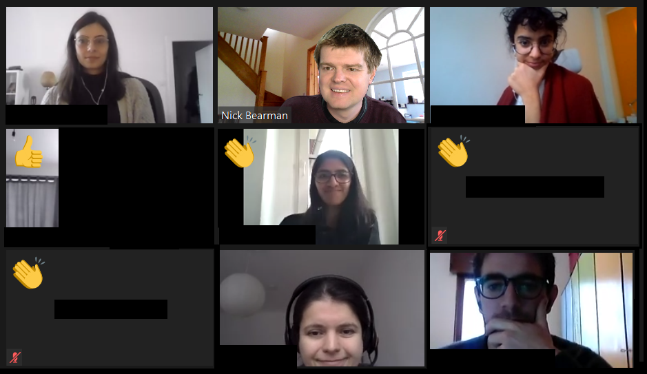
This blog post is the next in the series on running training sessions during the pandemic. As a recent Rasters Revealed conference there was a great session on running training courses during the pandemic and I thought I would share my experiences. This builds on my previous posts about teaching online and CPD.
Since March I have run 10 different training courses, a mixture of 3 or 4 half day sessions. There is always potential to improve more, but I think overall my structure works reasonably well. I have certainly received great feedback from my course participants.
“I loved the interactive bits, the worksheets and the breakout rooms. They” were really hands on and felt like a normal course, even though the course took place online.”
Astrid Pape, PhD Candidate, Freie Universität Berlin Introduction to GIS, Geospatial Data & Spatial Statistics course, November 2020
Screenshot of my teaching session in Jan 2021
I run the courses on Zoom, and limit the sessions to 3-4 hours maximum during a day – otherwise it ends up being a lot of intense screen time, which doesn’t help the learner, or me! Each session has a mixture of presentations (20-40 min) and then practical sessions. For the practical sessions, I split the main group up into small groups of 4-5 people using the breakout rooms feature. The practical sessions last for up to an hour, and I ‘walk around’ the groups by visiting each breakout room in turn and see how people are getting on. If they have questions, they can share their screens, and most of the time they group members talk to each other and share their questions within the group. They also have the option of pressing the ‘Ask for Help’ button which sends me a message, saying so-and-so has a question in room 2, and I can go to the room and see what their question is.
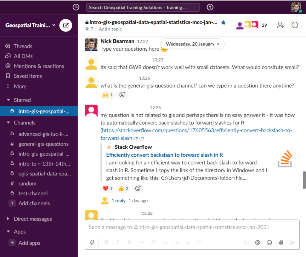
Over the whole period of the course (1-2 weeks) I run a Slack channel for that particular group. This allows me to share links to materials, slides, Zoom, videos, etc. as well as giving the students the option to ask questions to the group, or just to me (via the DM feature). During the actual sessions I also have 10 min at the end where I ask everyone to post a question in the Slack discussion about the material we have just covered. This is a great way of getting questions out of people and I then talk through the answers, adding in links later on if I don’t have them to hand there and then. All the sessions are also recorded and available to the participants (only) for 3 months.
Questions in Slack from a training session
I hope this is useful – if you have any experiences you’d like to share, please do in the comments below!
If you are interested in GIS training, then I have some courses coming up in Feb and April, and I am always happy to talk about running a course for your research group or organisation – just get in touch.
Our Professional Development Record (PDR) hours—CPD in the UK—are a key part of the surveying and geospatial professions. Previously PDR would have involved a mixture of in-person training, in-person conferences and self-study training materials. With the Covid-19 restrictions on meeting other people face-to-face, meetings are no longer possible, at least in the short term. Online video conferencing can substitute for some in-person events, and many PDR requirements are being relaxed to allow completely online PDR hours. So far, video conferencing has worked very well for training sessions and conferences, but I don’t think it will completely replace face-to-face meetings for a long time yet.
PDR requirements vary between industry and country, but all have some required training element, which would often be completed by attending in-person courses. This now all needs to be done online, at least in the short- to medium-term, and some accreditation providers have had to update their policies to allow this to be completed only online.
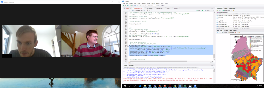
Providing one-to-one support during a training session. Video (left) and student sharing their screen (right)
In the UK, the Royal Institute of Chartered Surveyors (RICS) and the Chartered Institution of Water and Environmental Management (CIWEM) have one of the more formalized and strict PDR requirements. Both groups have moved all of their PDR courses online.
In the U.S., the GIS Certification Institute is completing its Technical Knowledge Exam online, and URISA (Urban and Regional Information Systems Association, one of the leading GIS professional bodies) has moved one of its in-person leadership academies online. In general, these events
have gone very well, but the online medium poses unique challenges of encouraging social interaction in an online space.
Certification for your PDR is also a tricky element depending on what area you are working in. Some of the certification elements can easily be completed online, using multiple choice answers or written responses to questions. Some of the more practical elements, like showing that you know how to service an RTK GPS unit, are tricky to examine online. I see a future where some of this might be done over live video calls, allowing the person being evaluated to demonstrate their skills to an assessor.
I run a number of small (10 to 20 attendees) in-person training courses in GIS and spatial analysis. All of these have had to move online, posing a range of different challenges. We all have access to video conference tools, and I think it is reasonable to say that some are better than others.
For most of my training courses I have used Zoom, which has worked very well with groups of up to 20 or so. My courses are a mixture of presentations (to the whole group) and then self-led practical workbooks, with the students receiving one-on-one support from me and a teaching assistant. I used the ‘Breakout Rooms’ facility within Zoom to allocate every student to their own room, and I could visit them and see how they were getting on, and they could share their screen if they were having any problems with their work.
Running a training course on Zoom.
This worked well, but we did miss out on the social aspect of the session – discussions over lunch, and students helping each other during the course. This is something that concerns many trainers and attendees alike, and I hope to see better solutions come along over the next few months.
I made use of the various security features in Zoom (particularly the Waiting Room) so we had no issues of Zoom bombing, where unauthorized viewers gate-crash the meeting and disrupt events. Moving courses online has allowed many more people to take part, particularly those who would otherwise be unable to travel for whatever reason. I have run several courses where participants have said it is great that the course is online, as otherwise they would be unable to take part, due to childcare requirements.
This increase in numbers has also been seen in bigger conferences and MOOCs, with a big uptick in numbers. For example, the very popular ESRI
Cartography MOOC (Massive Open Online Course) reached more people than last year (35,772 participants in the latest offering) and has also had a 31 percent higher completion rate. Some smaller GIS conferences that would usually run in person have also received an up tick in numbers from moving online, including FOSS4G UK 2020, which went from typically 100 attendees to 400, GISRUK 2020, which went from typically 150 to 300 and QGIS North America 2020, which went from typically 50 or so to 200.
Nearly all of these conferences are also now available as recorded videos online, providing a great resource for future learning. It is great to see these increases in numbers with more people learning what GIS can do and being able to apply it in their own areas of work.
While the move to online has many advantages, I don’t believe it will entirely replace in-person training and conferences. The social interaction element of online conferences has so far seemed the hardest to replicate online.
There are some very interesting platforms to encourage networking, but I’ve not yet seen any that work really well. I can see everything staying online until the end of 2020, but beyond that I see a hybrid model going forward, where there will be substantially more online events than before, but there will still be some in-person events.
Whether we can manage to run great hybrid events with links between the group physically in the room and the group online remains to be seen.
PDR Requirements in the U.S.
Licensure for land surveying varies from state to state, but there are more similarities than differences. Typically, licensing is handled by a state board of professional licensure, often the same board that oversees engineering licenses.
The requirements for licensure by state are similarly defined in the laws, codes, and statues for each. The requirements are typically a combination of experience, education, and examinations. Most require passing one or more standardized set of tests from the National Council of Examiners for Engineering and Surveying (NCEES), a non-for-profit organization dedicated to advancing professional licensure for engineers and surveyors.
Most states have adopted continuing education requirements and often the reporting of one’s hours is up to the licensee but is subject to an audit. Sometimes the requirements are stated as “units” and other times as hours, and the annual requirements are typically about 15 hours per year.
The resources for education credits or hours are typically met from educational institutions, surveying association/society conferences and seminars, and commercial education credit firms. There are a number of nationwide firms offering these, like PDH Academy and GeoLearn, some presented locally and others online.
Since the beginning of the pandemic, there has been a sharp increase in surveyors tapping online resources, and in turn, there has been a rise in online resources. Some states surveying associations, like West Virginia, have rapidly increased online course offerings.
For GIS professionals, the GISP certification, via the GIS Certification Institute (gisci.org), is broadly viewed as the standard. While it is not a license, like those required by states for surveying and engineering, the GISP can be a job application or contract requirement like other professional certifications. This is similar to the Certified Survey Technician, hydrography surveyor, and floodplain surveyor programs of the National Society of Professional Surveyors.
The GISP recertification requirements are a points system, based on a combination on education, contributions to the profession, and work experience. GIS is, by nature, very digital, and so is GIS education. Many resources for online education and collaboration were well established even before the pandemic began.