Cartograms are a great way of representing data that refers to people, and it allows you to give urban areas (which generally cover relative small areas) much more prominence than rural areas (which usually cover very large areas). The image below shows the usual geographic representation of the output areas, alongside the cartogram version. Note how the rural cluster (representing about 13% of the population) is very dominant in the ‘standard’ representation, but much less so in the cartogram representation.
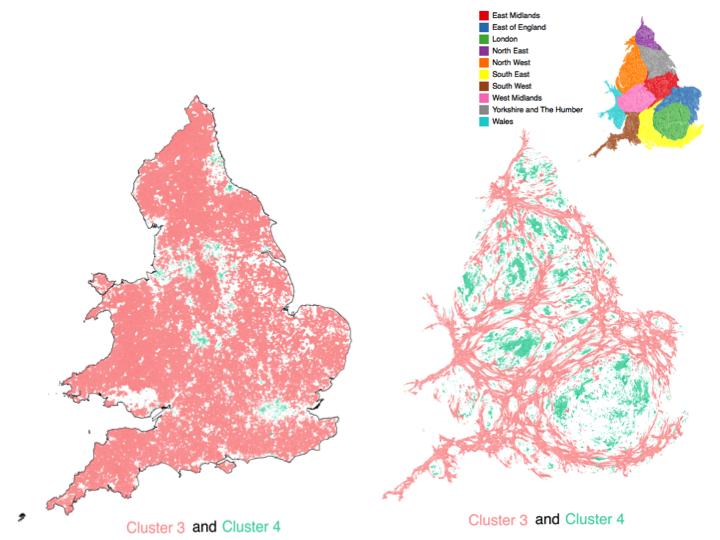
For my presentation at GISRUK2015 on TravelOAC (travel geodemographics) I was presenting a series of cluster data by 2011 Census output areas. Output areas are based around a standard population, with the result that many rural output areas are geographically large and many urban output areas are geographically small. When considering the classification data, it makes sense to give each output area equal consideration, so I decided to create a cartogram of the output area boundaries, based on the usual resident population.
I used a piece of software called ScapeToad which is a quick and easy way to create a cartogram from a custom data set. They have a good set of instructions on their website and the processing of all OAs in England and Wales (181,408 areas, 79mb shapefile) only took 49 seconds.
I was inspired by the cartograms used on the ONS Census Interactive website showing a range of variables. There are a number of ways of generating cartograms, and the ONS team used an approach based on http://lambert.nico.free.fr/tp/biblio/Dougeniketal1985.pdf where the browser does a lot of the heavy lifting. There is also an ArcScript available for ArcGIS at http://arcscripts.esri.com/details.asp?dbid=15638 which I used a few years ago and worked well then, but I’m not sure if it still does now!
P.S. Unfortunately I didn’t manage to see Chris’s presentation on cartogram methods (http://leeds.gisruk.org/abstracts/GISRUK2015_submission_83.pdf) as it was on at the same time as I was presenting!
Pingback: GISRUK2015 and TravelOAC | Nick Bearman
Pingback: Geocomputation and Analysis at the Essex Summer School | Spatial Spider