Author Archives: Nick

GISRUK 2020: A brave new world

Online conferences are everywhere now – and everything now has online as a prefix. The GISRUK 2020 conference was no exception, and originally scheduled for 21th – 24th April, it was postponed and moved online, to 21st to 23rd July. GISRUK is the largest annual GIS research conference, bringing together academics, researchers and students, as well as those from government, commercial and other sectors interested in GIS and its applications.

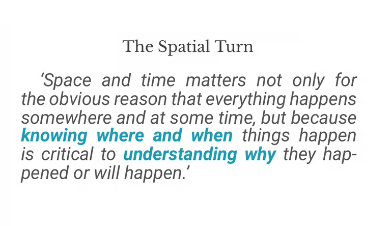
We had a excellent selection of keynotes, including Tao Cheng, Mark Birkin, Bruno Sánchez-Andrade Nuño and Krzysztof Janowicz. One theme that cropped up several times was that of networks and graphs as a new spatial data format, that one day might sit alongside vector and raster data sets – I will need to update my Intro to GIS slides! Tao talked about how we can think about networks underpinning urban areas, that we can turn any spatial data structure into a network, and that often the network links are much more important that the nodes themselves. Also, graphs and networks lend themselves to temporal data, with network links changing over time, which traditional GIS data structures have struggled to capture. Krzysztof Janowicz extended this to talk about knowledge graphs, linked data and the semantic web, and how graphs as a data structure underpin this. This allowed him and his team to develop knowledge based geo-enrichment, allowing us to ask questions of data that required both geo and non-geo inputs. He also included a great quote:

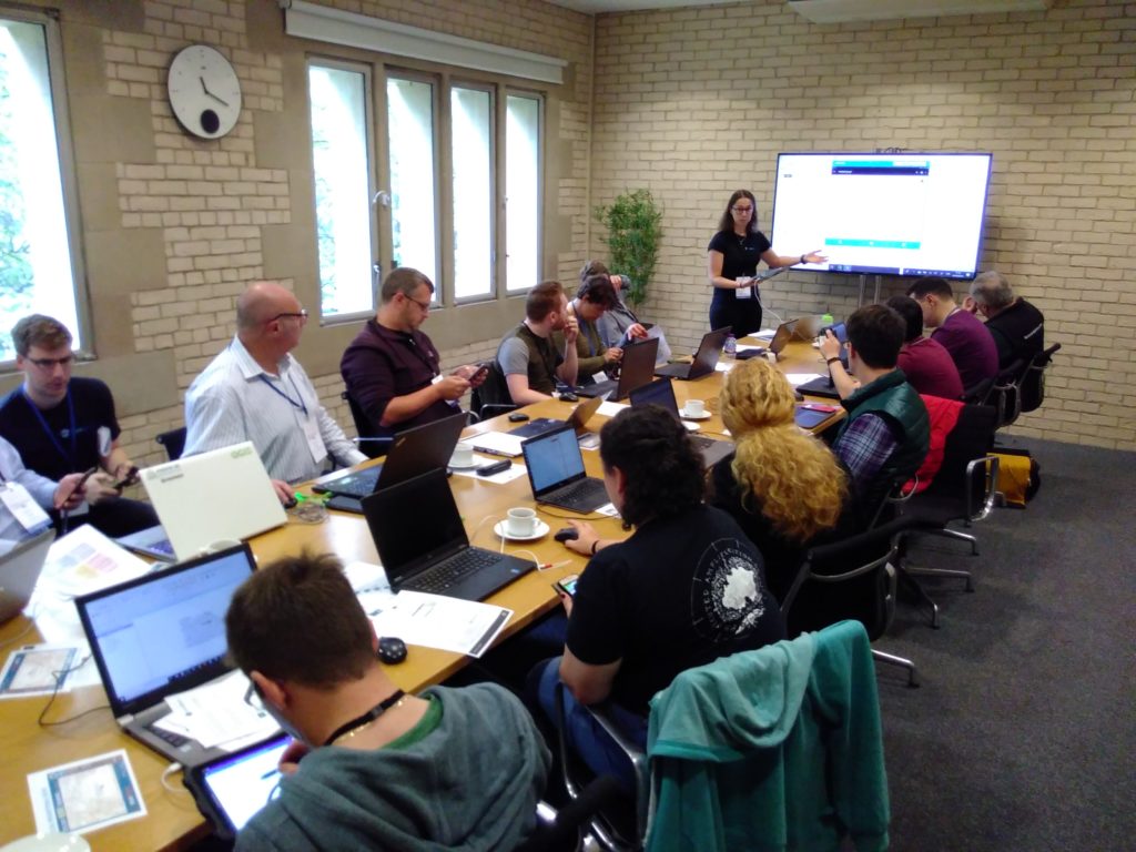
As usual at GISRUK, there were a great selection of ECR presentations, showing a huge diversity of PhD and ECR work (and even some MSc work!). Of particular note for me was Thomas Gilbert talking about VocalGeo: Using Speech to Provide Geospatial Context in the Classroom, using voice input in a classroom setting to control a digital globe. I was also very impressed by Timna Denwood, presenting her work on Alternative Interfaces for Improved Representation in Web-Based PPGIS, using an example of the islands of Barra & Vatersay, the western most inhabited part of Great Britain.

No conference is complete without the social element, and I have yet to attend a conference that truly cracks this problem. No amount of video conferencing software can replicate waiting in line for lunch and having a chat with whoever happens to be there! GISRUK has a social roulette space where people could go and chat, but it didn’t get a lot of use, potentially because of timing and a 10:00 – 17:00 programme being quite full on. Two elements that worked really well and created a good range of social interaction was the social quiz and tea time conversation with Sarah Wise. James Haworth confirmed the British tradition of being great at creating quizzes by putting together a four round quiz for us; identifying universities based on their logos, identifying cities that GISRUK had been to before based on interesting facts (e.g where was Marks and Spencer founded?), some great GCSE Geography questions(!) and identifying cities based on aerial photos.

Social wise, this was continued the following evening by an absolutely amazing panel discussion hosted by Sarah Wise. The panel, Denise McKenzie (Benchmark Initiative, Geovation, UK), Licia Capra (Professor of Pervasive Computing, Department of Computer Science, University College London) & Monica Stephens (Ph.D., University of Arizona, 2012), fielded Sarah’s questions with ease and provided amazing insight into their current work, challenges facing the GIS community. She also included some fun questions, including your favourite game (I’m glad to see Settlers of Catan was mentioned several times!), and what tattoo would you get to represent your work, in a reflective, pessimistic Pacific Rim style (I can’t remember the exact phrasing – please do comment if you remember!). Monica advised everyone to start blogging and putting your thoughts out there – something I can heartily recommend. Denise also gave some great careers advice for the ECRs (and all of us) listening – be open to what opportunities come your way, and that no-one would have been able to describe her current role to her when she was 21! This particularly resonates with me; my career plan was to do the traditional academic path and become a lecturer, professor etc. and I have taken a wildly different route, but suffice to say that I am happy with what I am doing, and happier that I think I would be if I was a lecturer (although that is another blog post!).

One massive plus of the online model is that it increases accessibility, and we had a great many more people register for GISRUK online than in person (~600 registrations, compared with 200 in person). We had people from all across the world, which is a great change to our usual UK and northern Europe focus.

As usual, GISRUK gives prizes to the Best Paper and Best Short Paper, voted on by the attendees. I would like to offer my congratulations to the prize winners this year:

Best Paper
Timna Denwood
Alternative Interfaces for Improved Representation in Web-Based PPGIS

Best Short Paper
Christopher Lloyd
Using machine learning to classify urban building footprints into residential / non-residential categories, in low income settings

Also congratulations to the CASA Award for Best Spatial Analysis:
SM Labib
Greenness visibility using viewshed analysis: A pilot study in Manchester

Every year the local organising committee do a fantastic job pulling the conference together, and Andrea Ballatore (Brikbeck) and James Haworth (UCL) did a great job this year:

Finally, I look forward to seeing you at the next GISRUK, which will be hosted by Cardiff University. Details to follow, please join the mailing list to find out more.

Cross-posted on
https://www.geospatialtrainingsolutions.co.uk/gisruk2020-a-brave-new-world/.

Using QGIS on AWS WorkSpaces

Klarna signs deal with AWS | FinTech Alliance

Amazon WorkSpaces are essentially a managed virtual machine (they use the term Desktop-as-a-Service). You can choose Windows or Linux, and they appear to be doing a free offer at the moment.

AWS (Amazon Web Services) are a great tool, and very powerful and flexible, but sometimes a bit intimidating. Their help is very good, and they offer tutorials and step-by-step guides which are really useful.

I used WorkSpaces as a option for people to use QGIS on a course, but who couldn’t install QGIS on their own machine. I’ve had this issues a couple of times, sometimes because they don’t have admin rights, sometimes because the computer just doesn’t like it.

They have an ‘easy-setup’ available in some regions, and I used Europe (Ireland). Europe (London) doesn’t have this option, unfortunately. I started with a ‘Standard with Windows 10’ which has 2 vCPU, 4 GiB RAM, 80GB Root volume and 50 GB User volume (disk space). I logged into this, and installed QGIS (v 3.12). You can then create an ‘Image’ of this, which AWS then wants you to put into a bundle. The key bit is then you can launch this Bundle as many times as you want – whether it is for one user or 20 users!

After a bit of experimenting with the Standard image (2 vCPU, 4 GiB RAM) it didn’t really have enough welly for QGIS, so I upgraded it to ‘Performance’ which has 2 vCPU and 7.5 GiB RAM, which worked much more effectivley.

The user can download an app (Windows / OSX / Linux) to run their WorkSpace, or run it through the browser, which is what my participant did. It worked well, although juggling the Zoom window and the browser window took a bit of practice I think.

Cost wise, the Performance option is costed by AWS at $8/month + $0.53/hour. I’ve always found with AWS I’m not 100% sure exactly what they will charge until I get the bill at the end of the month (as this is all + VAT as well). For 1 participant using the WorkSpace for a one day course cost be about $20 (£16).

Any comments or questions are welcome. Good luck and let me know how you get on using AWS WorkSpaces!

Cross-posted from
https://www.geospatialtrainingsolutions.co.uk/using-qgis-on-aws-workspaces/ .


Online teaching: The new wave

Using Microsoft Teams for delivering remote teaching

I’m sure there will be many posts about the online teaching we have been doing as a response to the coronavirus outbreak, and subsequently working from home. For my teaching at UCL, I have only had to do one session, and this was completed as a video call on Microsoft Teams.

I had relatively little time to change my teaching plans, with the decision to remote teach being made on Friday 13th, and my lecture scheduled for Tuesday 17th. My teaching group is small, only 7 students, so I decided to teaching the session live, as planned, but over video conference rather than in person. Setting up the team for the module on Microsoft Teams was straight forward, and I added all of the students on Sunday afternoon – and asked them to confirm, via Teams, that they have installed it successfully.

By Tuesday morning, all but one student confirmed through the chat on Teams that they had it up and running. I contacted the student who couldn’t, and they were unavailable for the session, and asked if I could record it. Recording has its’ own pros and cons discussed in many other places, but I decided I would be happy to record this session, and then delete it after it had been used. I messaged the other students to see if anyone objected, and nobody did.

I did a test call to experiment with the recording options (which were new to me). I have used Teams for video calls before, but if you haven’t I would recommend you have a test run through before the real thing.

I started the session 15 min before it’s scheduled time, and it took that long to get everyone added and check they could all hear me, see me and see the slides. Whilst actually giving the lecture, I found it a bit disorientating, as only 1 student out of the 6 had a video camera, the others were on audio only, so I couldn’t see them. It was hard to get visual feedback that they could see/hear/understand what I was talking about. I did stop a couple of times during the session to check all was being seen/heard/understood, and got some ‘yeses’ back, so that was working as planned.

This is a screenshot from my setup (with names and initials blanked out). I have a laptop with a separate monitor, so had the video chat on the external monitor and the slides on the laptop. My webcam is built into the laptop, so this meant I could look at the slides and be looking directly into the camera.

I didn’t have the opportunity to complete a discussion session in this format, so I don’t know how well that would have worked. I did ask for feedback on how the session went.

  • The feedback was positive, although sometimes there was a delay between when I changed the slide, and when it changes on the students screens (I used screen-sharing for showing the slides, as I couldn’t see how to do PowerPoint slide sharing within Teams, although supposedly it is there).
  • Students’ impression of Teams is very positive, particularly for modules with group assignments and the ability to add staff to chats.
  • One student said to me that they would definitely support additional lectures in this format!

My key hints and tips:

  • Test the software with plenty of time to spare
  • Make sure the students have good notice on which software you are going to use
  • If possible, confirm with the students that they have the software setup and working
  • It is better if students have video as well as audio, but audio only will work
  • During the session, make time to get feedback from the students – is everything working as it should be?
  • Be patient with yourself – we are working in extraordinary times and everyone understands this, so it won’t be perfect

So overall, it went fairly well I think. It’s not the same as in person teaching, but worked at short notice in a pinch. Any comments are welcome, and please do share your own experience.

Cross-posted at
https://www.geospatialtrainingsolutions.co.uk/online-teaching-the-new-wave/

FOSS4G UK 2019: Open Source, Geospatial, Sun and Lego

Edinburgh view from Salisbury Crags, just above Dynamic Earth

I had a wonderful three days in Edinburgh attending the most recent FOSS4G UK 2019 conference, based at Dynamic Earth in Edinburgh. Edinburgh has never had better weather, and I was assured by the locals that this was not normal! FOSS4G conferences have a special vibe to them that makes them unique to any other sort of conference. Various people have already written about that vibe, much more eloquently that I can.

There was a great selection of workshops and talks, and I ended up attending primarily workshops, which is a first for me. I have a particular interest in collecting data in the field, and so went to the workshops in QField and Input; both mobile phone apps to provide an interface to collect data on your phone, and then synchronise this back with a QGIS project when you get back to the office.

The wonderful Kirsten Reilly from ThinkWhere hosted the workshop on QField, explaining how we could setup a project in QGIS, synchronise this with the app to go out into the field. We had some of the usual technical issues, but nothing unusual for a practical session.

I also attended the Input workshop, run by the skilled Saber Razmjooei of Lutra Consulting. Lutra have developed Input as a alternative to QField, re-creating the app from scratch, and ensuring that Input can be operated on iPhones as well (QField is currently Android only). There are a lot of similarities between the programs, with QField being a bit more developed (i.e. less buggy) but Input having a cleaner interface and slightly more features. We actually also got to go outside and test the app out, which was great. My phone (a Fairphone 2) was actually not very happy with either app and my experience wasn’t flawless (but your mileage may vary, as they say).

The key differences are:

  • QField only works on Andriod, Input works on Andriod and iOS.
  • QField uses a cable to transfer files from your computer to the phone and back, Input uses the cloud (a website called Mergin, developed by Lutra) to manage the synchronisation process.
  • One key feature that Input has (which QField lacks) is the ability to record tracks (or lines) logging the route you took, where as QField can only record points.
  • QField is relatively mature whereas Input is very new.

Overall I would say that Input just edged ahead of QField. If you are looking to use these in the field, try out both!


One great talk was from Mike Spencer, discussing the pros and cons of using R or QGIS for cartography. There are so many options out there, and his talk gave some great examples of amazing outputs from R and QGIS. There was a whole slew of talks that I would have liked to have attended, but couldn’t because things clashed. Fortunately all of the talks at FOSS4G UK 2019 were live streamed and recorded, which allows anyone to experience the conference.


I led a workshop on contributing to QGIS documentation, which was very well received with 10 participants. Contributing to documentation is a key element of open source software and is something that often gets neglected. We covered how QGIS documentation is structured, how to work with GitHub to make changes on the web, and how to work with documentation locally. The workshop was only 90 minutes long, so we didn’t have time to actually make any changes to the QGIS Documentation, but we did have great fun experimenting with the example repository I made for it. Thanks to denelius, Nikosvav, mikerspencer, SteveLowman, myquest87, hopkina, cearban and TBreure for attending and getting involved.

At the Community Sprint on Sat 21st, a group of 9 of us had a go at a variety of coding and documentation issues. I led a group of three experimenting with a number of QGIS Documentation issues. We all had a deep dive into GitHub and learnt a lot! We fixed a range of issues from unclear documentation to new features in the QGIS Master that needed to be added into the documentation. These included:


The organising committee put together a great conference and captured the unique feeling of a FOSS4G conference. Many thanks to all of them, and they even created a Lego video to celebrate the amazing conference. FOSS4G conferences happen all across the world, so keep your eyes open for one near you in the future!


Also posted with xyHt at
https://www.xyht.com/spatial-itgis/foss4g-uk-2019/.


National Map Reading Week

The 27th May to 2nd June is National Map Reading Week, created by the Ordnance Survey to promote maps, mapping and all things to do with space! There has been a great selection of coverage across the internet – one of my favourite was a ‘map-folding’ competition featuring the Calder Valley Mountain Rescue Team, setting the bar at 8.16 seconds!

When we say ‘maps’ people are often talking about the paper based product, I would argue that reading a digital map is as an equally important skill. Navigation is always something that has been vital to humans, and now that we travel further than ever before, knowing where we are going is vital!

For on-phone sat nav, Google Maps may be the go-to choice for many and works very well. It certainly works well for me in the car when required! However, for public transport in London in my opinion, you can’t beat CityMapper. It gives you a huge range of flexibility of different methods (walk, bike, public transport) and also gives you costs which is very handy. They also have a good sense of humour, showing how many calories a walk or cycle will use up and how many cupcakes that is!

This is also a nice excuse to mention two other map related things: bed cartography for a) humans and b) cats!

http://thedoghousediaries.com/3586

https://www.facebook.com/weloveallthecats/photos/a.577358232351406/2200795980007615/?type=3&theater

Finally, just to say this is a great time to get out there (with or without a map) and enjoy the scenery!

View of Fortuneswell and Weymouth from Portland


UAVs, spatial data and data use: GISRUK 2019, Newcastle University

GISRUK is the annual GIS Research conference in the UK which showcases the latest in GIS (Geographical Information Science) and Geomatics Research from the UK and across Europe. I attended the 4-day conference at Newcastle University and it was amazing to see the latest developments from across the geospatial community.

One of the key themes for me that emerged from the conference was the debate between whether spatial data is ‘special’ or is it data just another data type, one among many? For many years when GIS was a niche area requiring specialist skills to use, there was a clear argument that spatial was special. Now the bar of entry to using spatial data is much lower, through the use of tools such as Google Earth, Tableau and even ArcGIS Pro, which means many more people can get the benefit of using spatial data and analysis. Spatial data is another tool in the toolbox of analysts, which allow us to be solution architects (solving problems) rather than geo-engineers (tinkering with projections and file formats). I don’t think we are yet at the point where using spatial data is as easy as using an Excel table, but we are so much closer than we were even just 5 or 10 years ago. The traditional desktop GIS package (ArcGIS / QGIS) is no longer the only way of working with spatial data: advanced users have more data science orientated solutions such as Python or R, and non-technical users can get great maps from Tableau. In fact James Bowles found many organisations in the third sector (charities and NGOs) use Tableau to do data analysis (including spatial analysis) rather than using tools like ArcGIS.

Spatial data is becoming more widely accessible, with many users in the third sector choosing Tableau for their spatial analysis, over traditional desktop GIS such as ArcGIS or QGIS.

One of the regular features of the GISRUK Conference Series is a key focus on Early Career Researchers, those students who are currently studying MScs or PhDs. About 60% of them will go straight to work in industry after their studies, so this is a great opportunity for them to find out more about working in industry. Both junior staff and senior consultants came in from ARUP to explain what ARUP do and why the students’ skills are vital in industry. One of the big areas of growth is the combination of remote sensing and machine learning; these skills are very sort after by industry and there are some very exciting developments in the earth observation field.  Machine learning and AI (artificial intelligence) are gaining a lot of coverage, both in terms of how and where we use them, but also from the point of view of ‘how do we use AI ethically?’, and ‘what new questions do we have to think about when we are using AI & ML?’. One of the keynote speakers, Prof. Renee Sieber talked about the importance of public participation in what she termed ‘GeoAI’ (AI applied in a geospatial setting) and the fact that the fact that AI is not unbiased at all; it reflects our societal biases and we need to be careful when using it.

The use of spatial data is fundamental to all of the work presented at GISRUK, and availability of data is often not as clear cut as it really should be. In the panel discussion on ‘How will the opening up of geospatial data help the GIS community?‘ one of the key elements that was discussed was data infrastructure. The provision of metadata is often quite important in terms of being able to select suitable data for specific projects, and if we are to further develop automated data process (including data selection) then comprehensive metadata is key to much of this, and currently fairly lacking. Dr Gobe Hobona, from the Open Geospatial Consortium, demonstrated how the OGC have been instrumental in developing a range of standards that are key to the interchange of spatial data between different software and organisations, including the provision of metadata. Gobe also mentioned the developments of UAVs, both as tools for spatial data collection but also as transformative decides in geospatial interoperability, allowing access to more and more varied data sources. They are also very cool, such as the spectacular swarms of UAVs we saw at the recent Beijing Olympics!

Upcoming Trends identified by the Open Geospatial Consortium, including UAVs and indoor geospatial solutions (see also https://github.com/opengeospatial/OGC-Technology-Trends).

UAVs were mentioned across many different themes in the conference, including for data capture, combination with AI (to identify cracks in road surfaces) to impact on birdlife in wildlife reserves. They are clearly now entering a phase where they are part of a wider toolbox, rather than a novelty in themselves, and so are maturing into a new data source and product. There was also a very interesting presentation by Kevin Minors on crowd management, including techniques for modelling the crowd as a whole from a series of static data points, which has a wide application in highly variable crowds, such as railway stations.

Overall this was a great conference with a fascinating insight into the cutting edge of research in spatial data and GIS. Next year GISRUK is at UCL and Birkbeck, University of London, April 21st to 24th – see you there!

To find out more about new GIS technologies, how to use them and how they could benefit your research and analysis, sign up to the Geospatial Training Solutions mailing list or send me an email!

Cross-posted from
https://www.geospatialtrainingsolutions.co.uk/uavs-spatial-data-and-data-use-gisruk-2019-newcastle-university.

Spatial R – Moving from SP to SF

I recently ran my ‘Introduction to Spatial Data & Using R as a GIS’ course for the NCRM at the University of Southampton. This was the first time after I had updated the material from using the SP library to using the new SF library. The SF (or Simple Features) library is a big change in how R handles spatial data.

Working with RStudio at University of Southampton

Back in the ‘old days’, we used a package called SP to manage spatial data in R. It was initially developed in 2005, and was a very well-developed package that supported practically all GIS analysis. If you have worked with spatial data in R and used the syntax variable@data to refer to the attribute table of the spatial data, then you have used the SP package. The SP package worked well, but wasn’t 100% compatible with the R data frame, so when joining data (using merge() or match()) you had to be quite careful, and we usually joined the table of data to the variable@data element. For those in the know, it used S4 data types (something I discovered when I generated lots of error messages whilst trying to do some analysis!)

The SF library is relatively new (released Oct 2016) and uses the OGC (Open Geospatial Consortium) defined standard of Simple Features (which is also an ISO standard). This is a standardised way of recording and structuring spatial data, used by nearly every piece of software that handles spatial data. Using SF also allows us to work with the tidyverse series of packages which have become very popular, driven by growth in data science. Previously, tidyverse expected spatial data to be a data frame, which the SP data formats were not, and often created some interesting error messages!

The Geospatial Training Solutions ‘Introduction to R’ course is very well established, and I have delivered it 14 times to 219 students! However, it was due for a bit of a re-write, so I took the opportunity of moving from SP to SF to do restructure some of the material. I also changed from using the base R plot commands to using the tmap library. As a result, it is now much easier to get a map from R. In fact, one of the participants from my recent NCRM course in Southampton said:

“It was so quick to create a map in R, I thought it would be harder.”

Participant on Introduction to Spatial Data & Using R as a GIS, 27th March 2019, University of Southampton

They were blown away by how easy it was to create a map in R. With SF and tmap, you can get a map out in 2 lines (anything staring with # is a comment):

LSOA <- st_read("england_lsoa_2011.shp")  #read the shapefile 
qtm(LSOA) #plot the map

You can also get a nice looking finished map with customised colours and classification very easily:

tm_shape(LSOA) +
tm_polygons("Age00to04", title = "Aged 0 to 4", palette = "Greens", style = "jenks")
+ tm_layout(legend.title.size = 0.8)
Count of people aged 0 to 4 in Liverpool, 2011 Census Data.

However, unfortunately not all spatial analysis is yet supported in SF. This will come with time, as the functions develop and more features are added. In the practical I get the participants to do some Point in Polygon analysis, where they overlay some crime points (from data.police.uk/data) with some LSOA boundaries. I couldn’t find out how to do a working point in polygon analysis* using this data and the SF library, so I kept my existing SP code to do this. This was also a useful pedagogical (teaching) opportunity to explain about SF and SP, as students are likely to come across both types of code!

*I know theoretically it should be possible to do a point-in-polygon with SF (there are many posts) but I failed to get my data to work with this. I need to have more of an experiment to see if I can get it working – if you would like to have a try with my data, please do!

The next course I am running is in Glasgow on 12th – 14th June where we will cover Introduction to Spatial Data & Using R as a GIS, alongside a range of other material over 3 days. Find out more info or sign up.

The material from this workshop is available under Creative Commons, and if you would like to come on a course, please sign up to the Geospatial Training Solutions mailing list.

Cross-posted from
http://www.geospatialtrainingsolutions.co.uk/spatial-r-moving-from-sp-to-sf.

The Northwest Digital Research Methods Festival: Researching the Digital/Researching Digitally

Liverpool Cathedral

I spent a great couple of days up in Liverpool, attending the North West Digital Research Methods Festival at the University of Liverpool. It was great to be back in Liverpool and catch-up with colleagues and friends from my post-doc days there in 2013-16. The city has changed quite a bit, and my old office now overlooks a major building site instead of a green park!

The conference looked at Digital Methods from a broad social science point of view. It was great to spend some time thinking about digital methods from a different perspective. Key to all digital methods are longevity and there were lots of discussions about how data resources are made available to scholars in the long term; including decisions made to simplify a website interface to ensure it will remain working for longer with limited support.

Warren Pearce
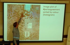
It also made me think about how we process data. Warren Pearce presented on social media data and was critiquing the fact that we often focus on the text content of messages, and ignore the visual elements. This is missing out on a key element of the conversation (think of any social media content you have recently looked at) and the visual elements should be included in the analysis. My initial thought was that this was a technological hangover, with text being much easier to process than visual. However, I learnt that there is also a cultural element with text based information being seen as much more valuable than pictorial information. Warren also highlighted a fascinating visualization of the front pages of the New York Times, highlighting how it had changed from just text to a mixture of text and black & white images, then to text & colour images. Warren’s recent paper on the topic is at https://www.tandfonline.com/doi/full/10.1080/1369118X.2018.1486871

There were a whole range of presentations looking the digital research and digital data, from a wide range of different perspectives. These included using physical objects to encourage interaction and engagement in a museum environment, to considering the best ways of increasing accessibility of digital archives such as photo libraries of African Rock Art or historical criminal life courses. Have a look at https://twitter.com/hashtag/nwdrm for Tweets from the conference.

The second day consisted of a series of practical workshops, which included one run by me on GIS. I was pitching GIS as a great digital method and I think I may have converted some people!

https://twitter.com/pdbrooker/status/1040211576874262535

I had a 30 minute slot and managed to cover a very brief introduction to GIS, and did a practical using Google Fusion Tables. The materials are available here (http://bit.ly/digital-space) and please do drop me a line at nick@geospatialtrainingsolutions.co.uk if you are interested in learning more about GIS.

I would really recommend that everyone considers attending conferences outside of your usual ‘academic sphere’ – you never know what you are going to see, what ideas might be sparked off, or what future contacts & employers you could be meeting!

Cross-posted from https://www.geospatialtrainingsolutions.co.uk/the-northwest-digital-research-methods-festival-researching-the-digital-researching-digitally/.

Book review – Cartography: an introduction

Cartography: an introduction
Second Edition. BCS £12-99
http://www.cartography.org.uk/product/cartography-an-introduction-second-edition-2017/

The British Cartographic Society have updated their classic book ‘Cartography: An Introduction’, developing the first edition from 2007. This book is a great overview of key cartographic concepts, covering everything from colour and symbology to fonts and the finer points of kerning. The book is accessible and a very valuable resource to anyone involved with  cartography and looking to make better maps.

The book is split into easily accessible sections, starting with the basics (What is a map?),  developing on the key theories (projections, datums and coordinate systems), and applying these in a variety of settings (thematic mapping, symbology, page layout and many
others). Everything you might expect to be there is present, including scale, generalisation, colour, text and font usage.

There is also a discussion of different types of maps (choropleth, dot maps, isolines and a whole range of others) with a great repertoire of selections. I particularly like the mapping examples they provide within each section, where they show a variety of great designs, as well as demonstrating how a poorly designed map can be improved. This allows us to see why a particular design is bad, and what we can do to improve it. Even the often forgotten and ignored modifiable areal unit problem (MAUP) gets a mention, reminding us to be careful with
aggregated data.

The book is packed with useful tips and rules of thumb (“If you use more than 12 colours on a map, it becomes very hard to interpret” and “Labels on coastlines or the edges of large lakes look better if they are places out at sea. Try not to straddle the land/water boundary”). I was slightly surprised not to see more on Colour Vision Deficiency (colour blindness), with the rule of thumb I have often used: avoid using different shades of red and green on a map (as red-green CVD is the most common form).

Many cartography books are often either explicitly software specific, or clearly show the influences of one specific piece of GIS software. This book manages to be software independent, although the legends will look familiar to regular ESRI users! The concepts are written in a way where they can be applied to the map making process in any software or medium. The book finishes with a list of key tips or things to check if you have 5 minutes, 15 minutes or 50 minutes to finalise your design.This pulls out the key aspects and accepts that sometimes we don’t have enough time to spend on the design as we would like.

‘Cartography: An Introduction’ is available at a very reasonable £12.99 from the BCS and it is a book I would recommend to anyone creating and designing maps on a regular basis.

Nick Bearman

This book review was first published in the Society of Cartographers Bulletin (PDF, 2.6MB).

ESRC Research Methods Festival 2018

During the amazingly sunny weather a few weeks ago, I managed to spend a couple of days indoors, hiding from the sun at the ESRC Research Methods Festival at the University of Bath. Every 2 years, the National Centre for Research Methods have organised this conference to showcase unique and new methods from across the social sciences. The conference covered everything from ‘Multi-scale measures of segregation data’ and ‘Quantitative methods pedagogy’ to ‘Do participatory visual methods give ‘voice’?’ and ‘Comics as a research method’.

It was also fantastic to meet a range of academics and researchers who I would not normally meet. I met a number of people who I had communicated regularly with on Twitter, but never met in person before!

I was presenting in a session on ‘Multiscale measures of segregation data‘, where we were discussing different approaches to how deprivation can be measured across different locations. One of the major characteristics of grouped spatial data is the MAUP (Modifiable Areal Unit Problem), where the method used to group your data will have an impact on the results of any analysis. The session was a great collection of presentations, all of us looking at similar issues but often taking quite different methods to approach them.

I showed how using variograms based on the PopChange data set to look at spatial segregation can help avoid some of the impacts of imposing scales on the data, and instead use the data to tell us at what scales the variations are taking place.

Across the whole conference there was a range of content using scripting languages, and R and Python featured significantly across the board, to the surprise of some of the participants, including me:

https://twitter.com/madalinaradu07/status/1014605088852193280?s=19

Like most conferences, there were so many interesting sessions and it was often difficult to choose which track to attend! The keynotes were all thought provoking. Danny Dorling presented a range of interesting information on current levels of inequality in the UK, and warned us that it is likely to get worse before it gets better. Donna Mertens called on all of us to think about how our research can change things, and if it doesn’t, why not?

It was a great methods conference, and reminded me about how many different methods are out there. If you would like a chat about how using GIS could help with your research or work, please do give me a call on 01209 808910 or email at nick@geospatialtrainingsolutions.co.uk.

Cross-posted from http://www.geospatialtrainingsolutions.co.uk/esrc-research-methods-festival-2018/